These are some examples of the graphic work I’ve been creating for my friends on the Irie Community Discord server and other
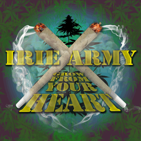
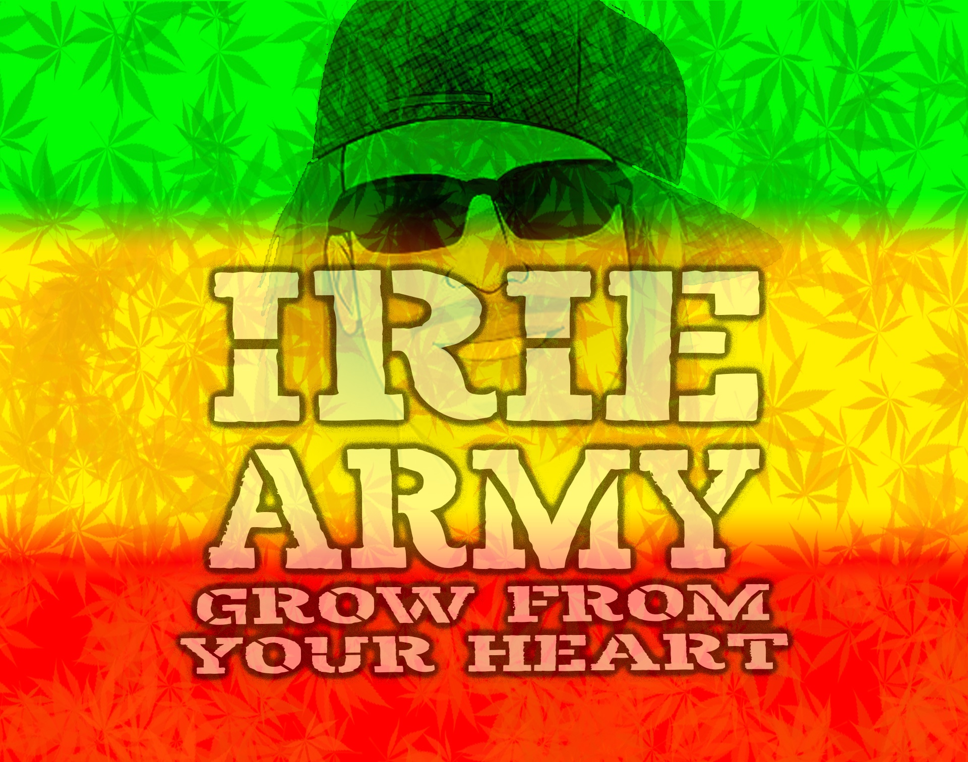
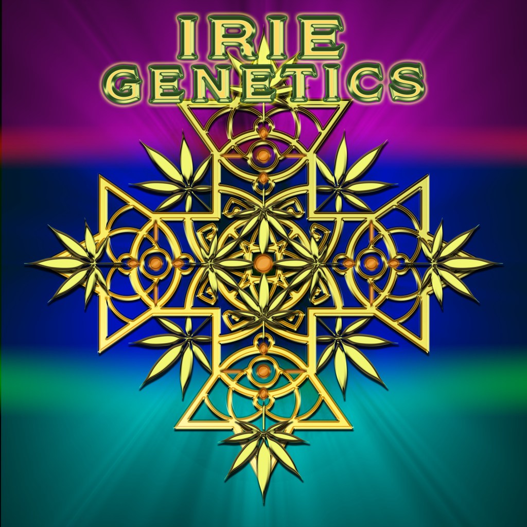
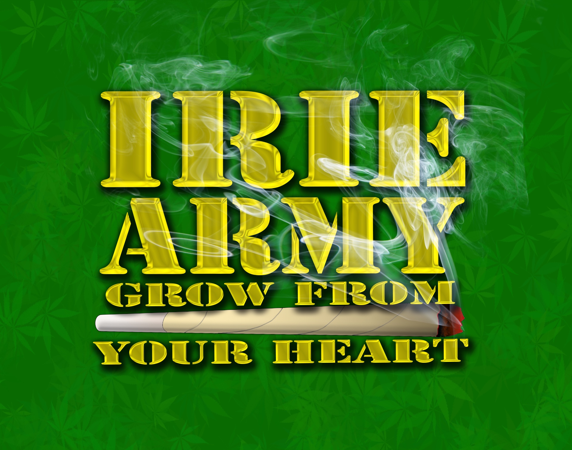
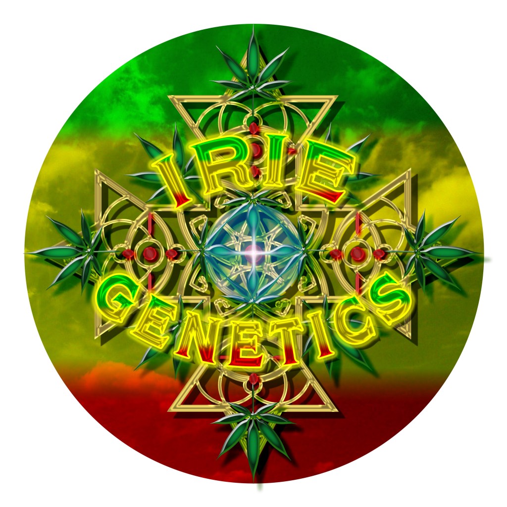
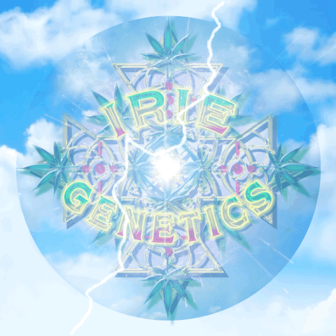
Irie Community
The Irie Community is a group of like minded individuals who follow and cultivate Irie Genetics, Grow From Your Heart Podcast, and its Owner Rasta Jeff on Discord. These images and animations were done for banners and icons.
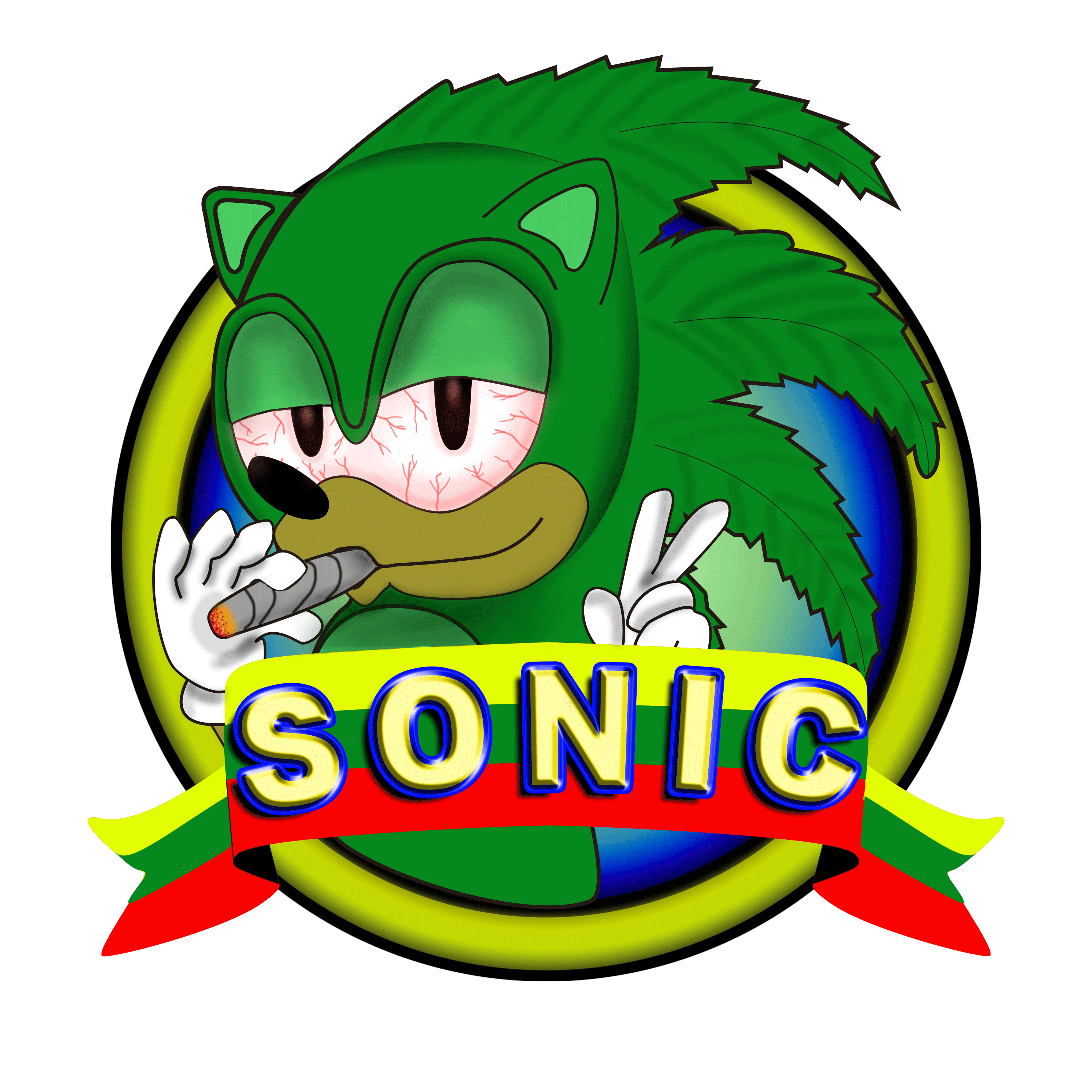
Sonic
Sonic’s icon was created using Photoshop and a reference image of sonic the hedgehog. I couldn’t decide if I wanted to go the direction of the Hedgehog or go with the fast food chain Sonic. I decided that I had much more options with a character verses a logo with shapes and colors like the Sonic logo.
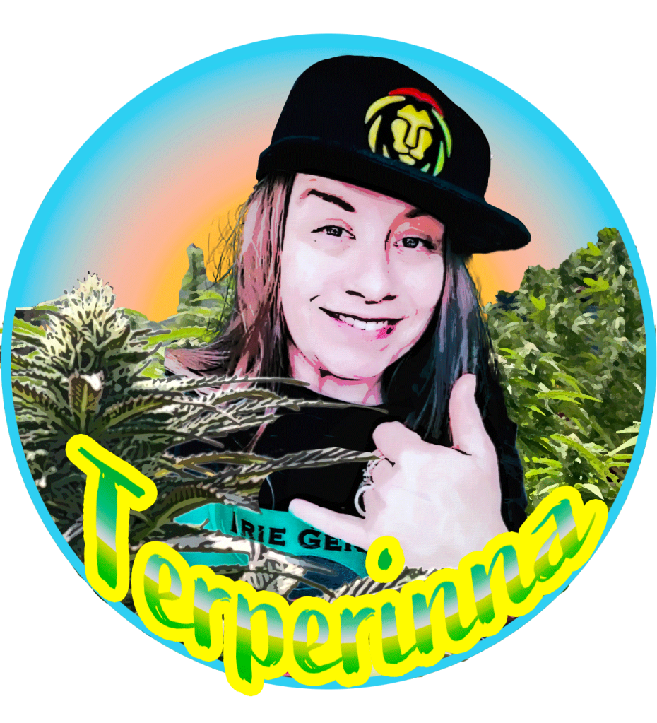
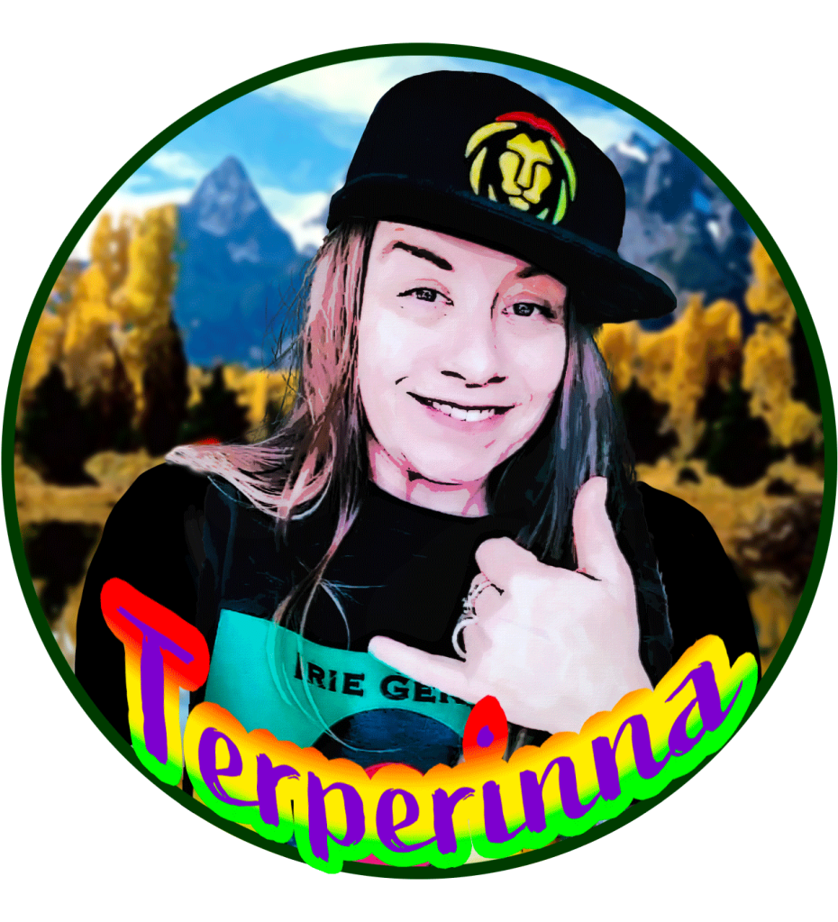
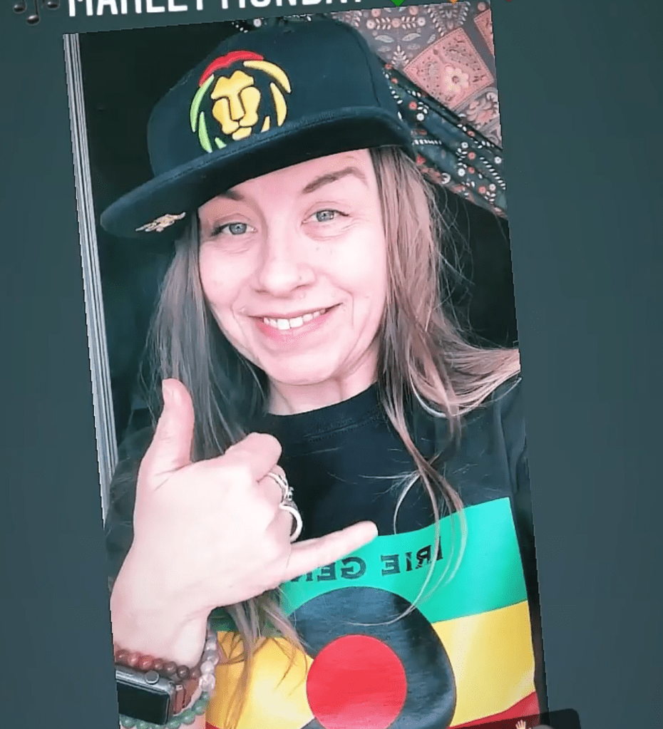
Terperinna
Terperinna’s icon was another take on photo manipulation to achieve that Artsy look. The original photo was mirror imaged and the shoulder were cropped out so that had to be fixed. There were many comps mostly playing around with the backgrounds, one of which is a “clean” logo and one has cannabis content.
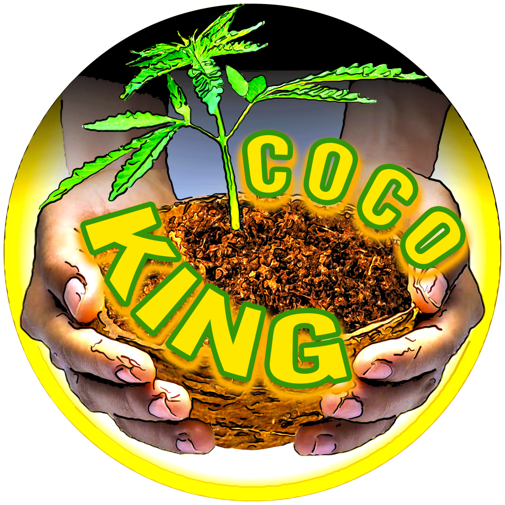
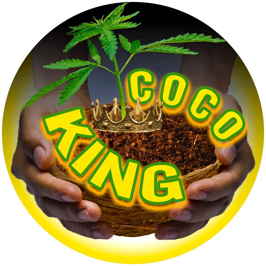
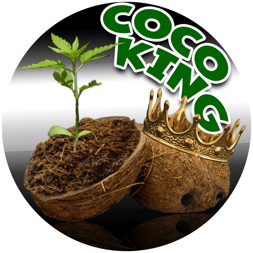
Hempire Dave
Empire Dave’s logo was created around the words “coco King” which gave me several ideas of course around the obvious of coco and king. The first thing I thought was a coconut with a crown perhaps and the second idea was the hands holding a coconut. I had many different options around the background of the comps. Dave ended up with the outstretched hands.
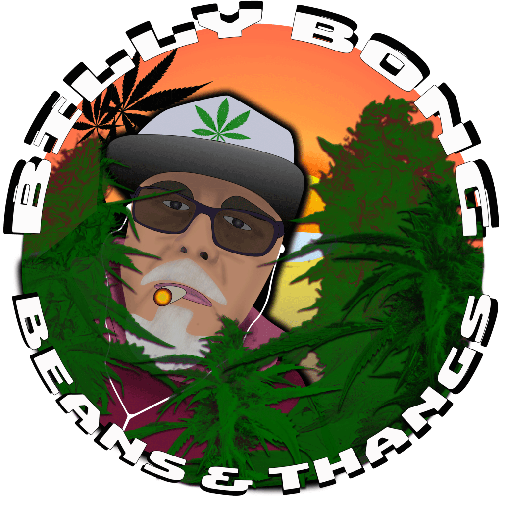
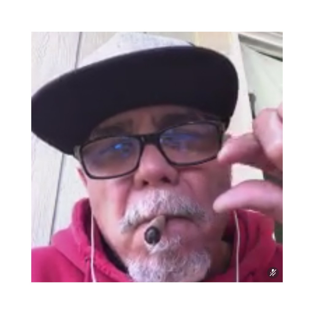
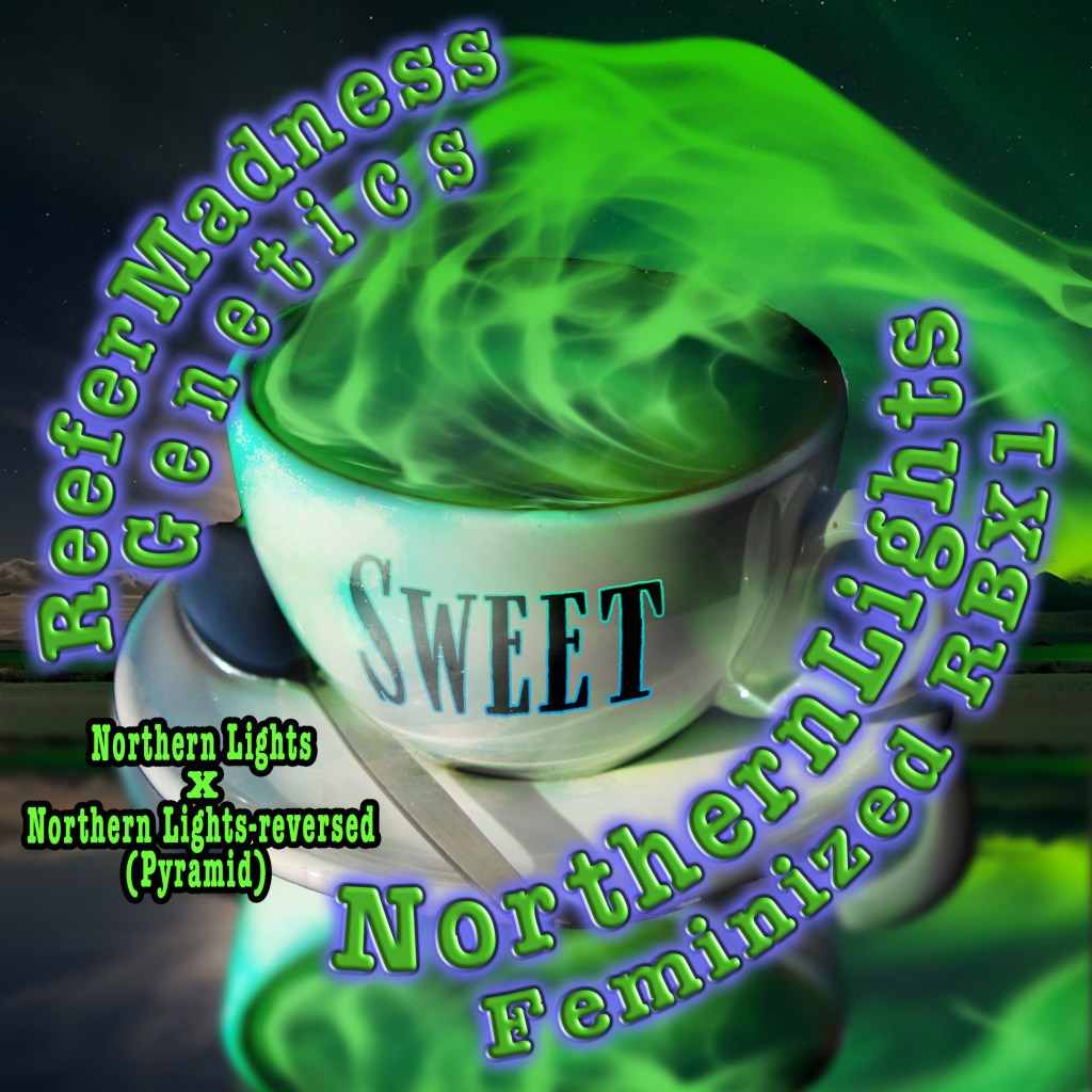
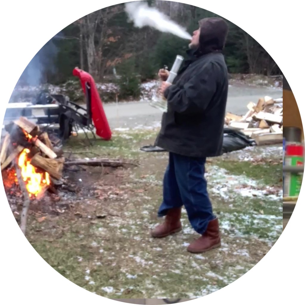
Billy Bong Smokin
Billy’s icon was created using Photoshop and a screen shot of Billy. I had a lot of fun creating this icon, the process flowed very smoothly and I felt it took on a life of it’s own. Billy lives in a tropical land so I included a small tropical island with a cannabis plant replacing a plam or coconut tree.

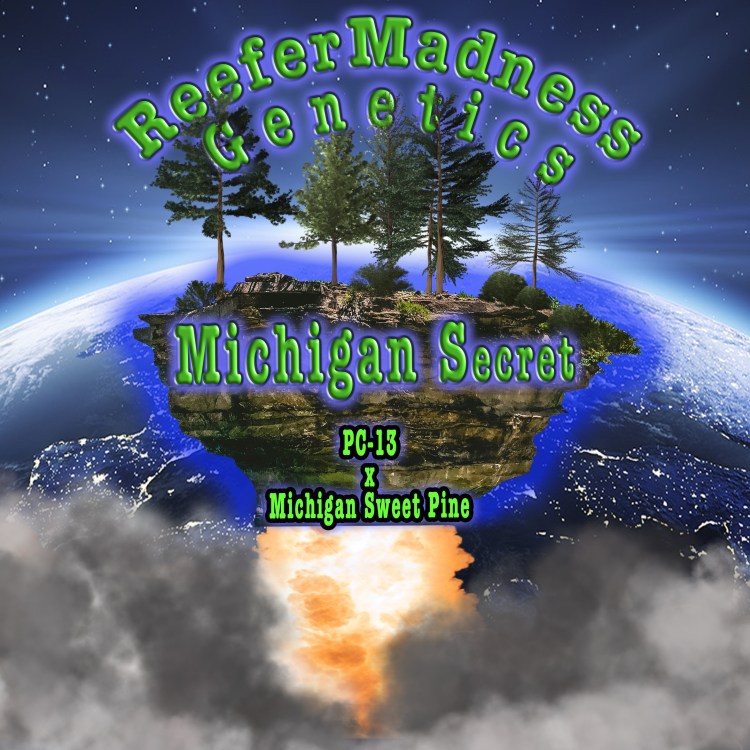
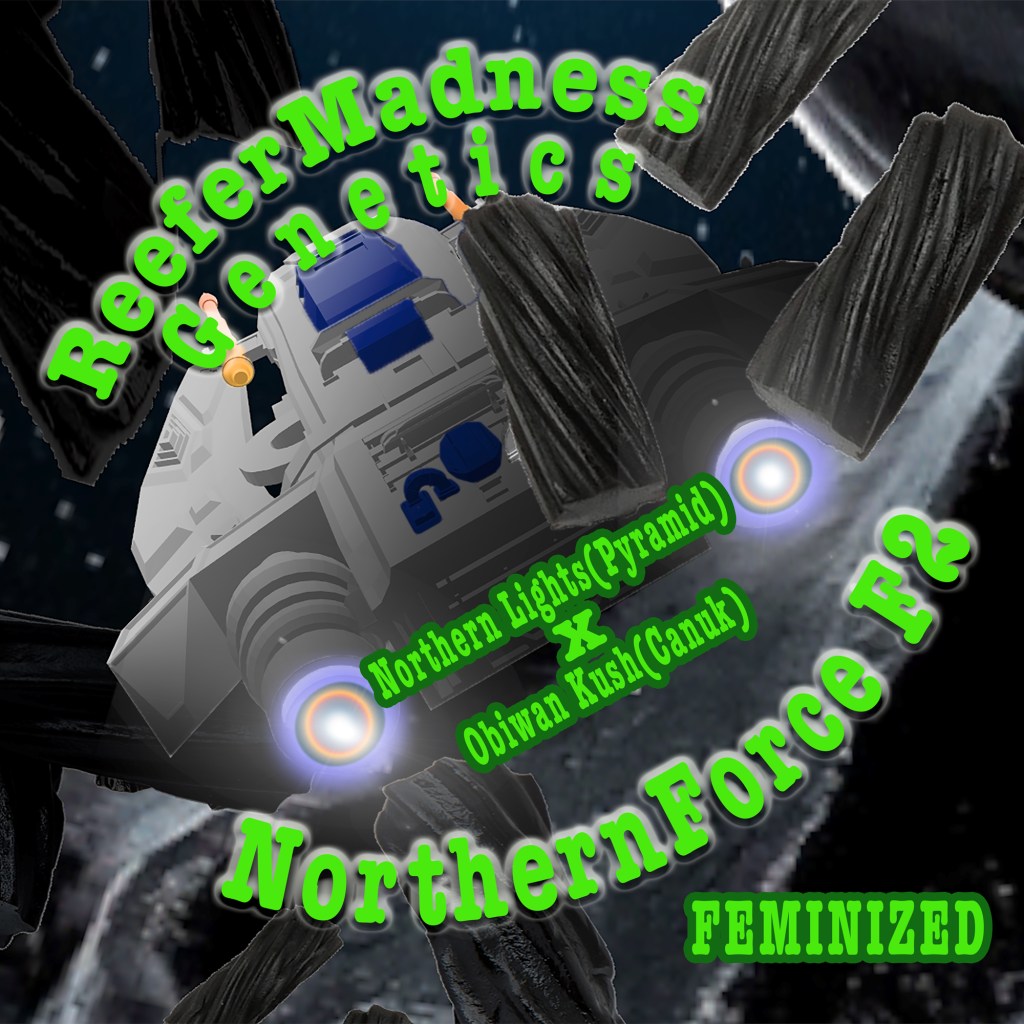
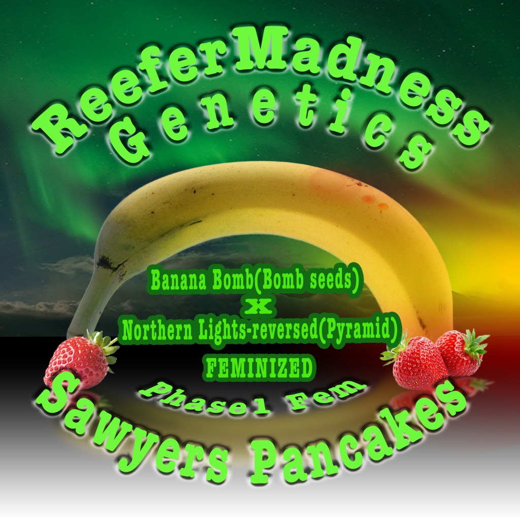
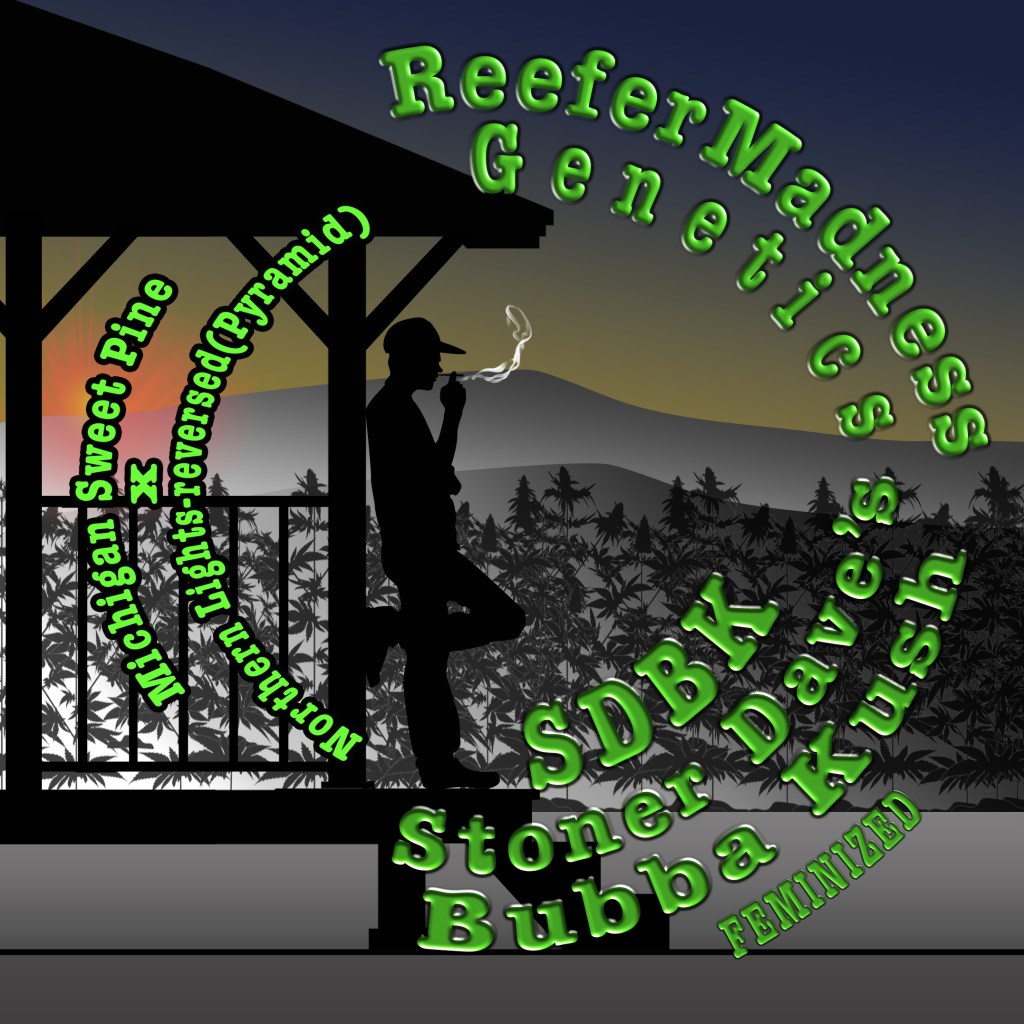
Stoner Dave
Stoner Daves icon actually derived itself from the work I was doing for his seed packaging, sometimes things just develop themselves. I started on this project for his seed packaging and Dave had very specific instructions on what he wanted his designs to include. Daves instructions are listed below so you can see where each design came from


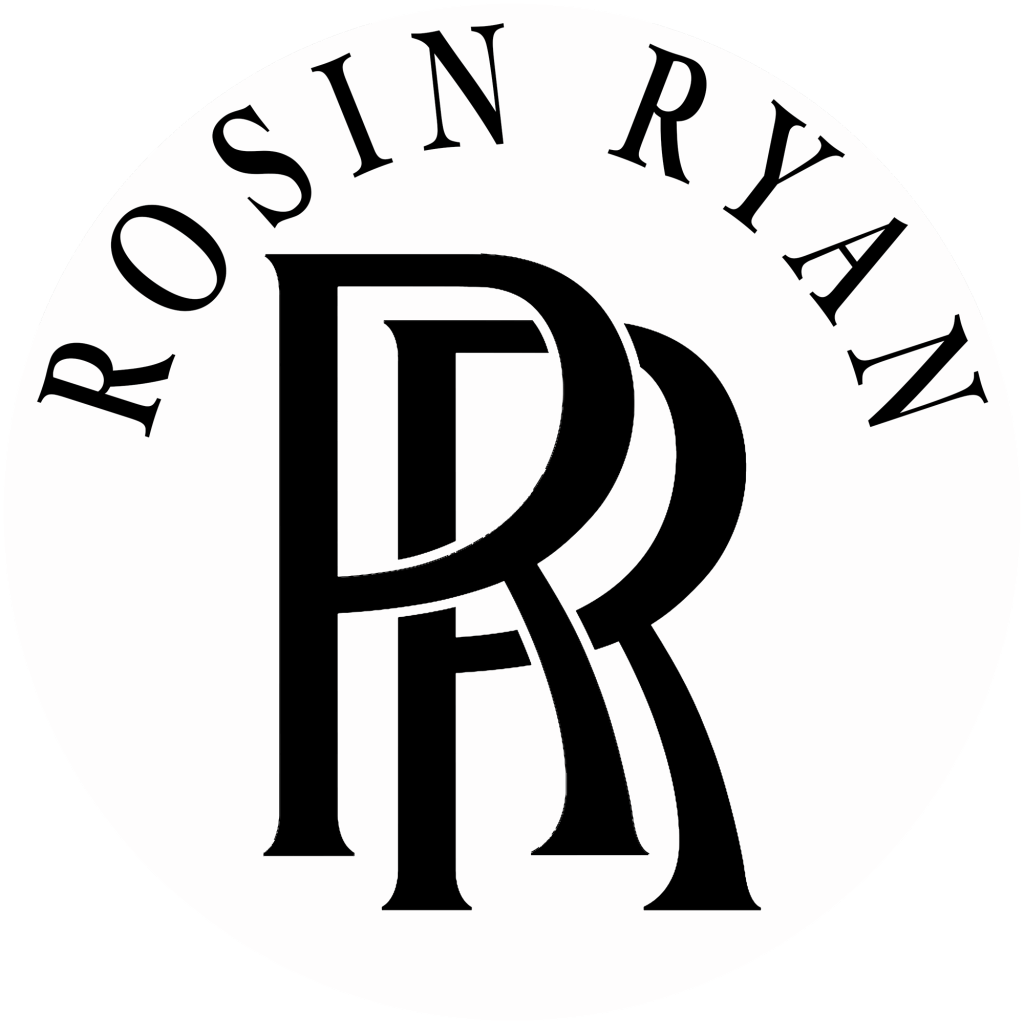
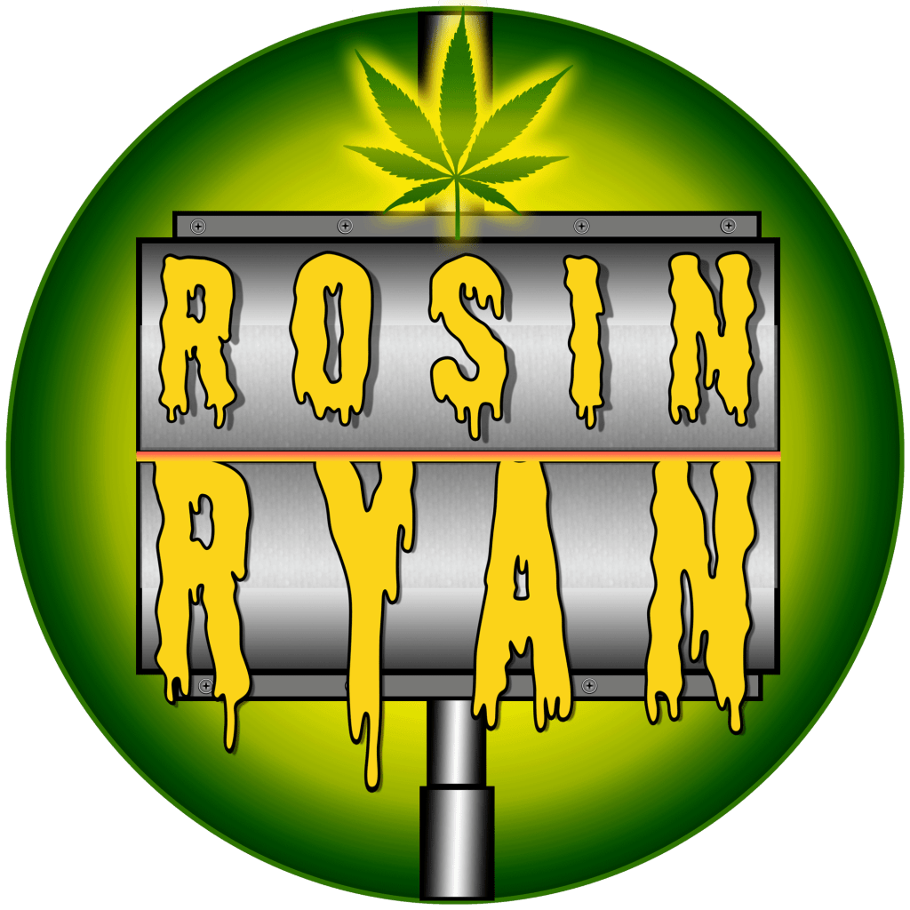
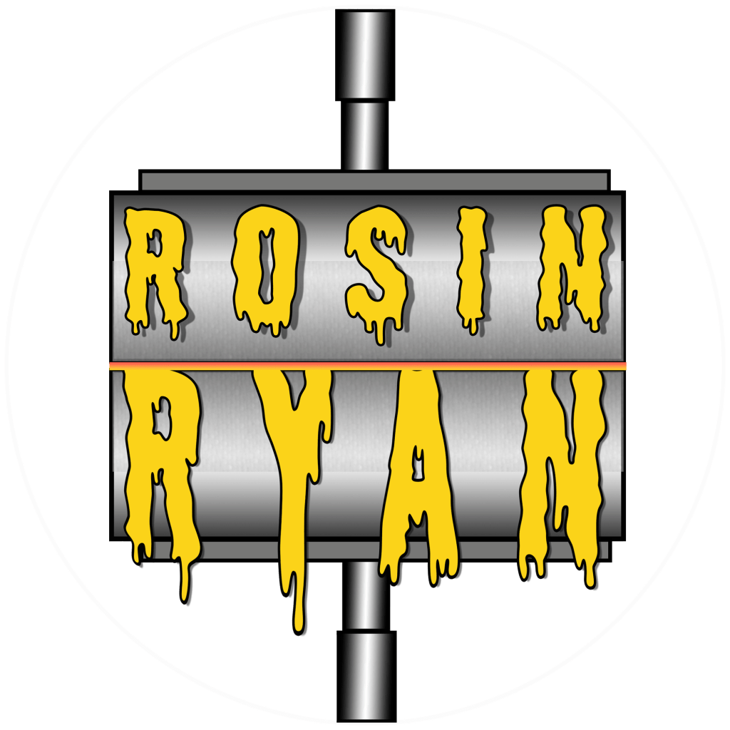
Rosin Ryan
Rosin Ryan’s Icon went through a couple different designs. The first design was intended to be a rosin press squeezing out his name in Rosin. Then I thought the two r’s could be taken directly from Rolls Royce in a very simple design. The RR is borrowed from the rolls Royce logo and I intended on working on it further to make it more unique but for now it’s the original RR.
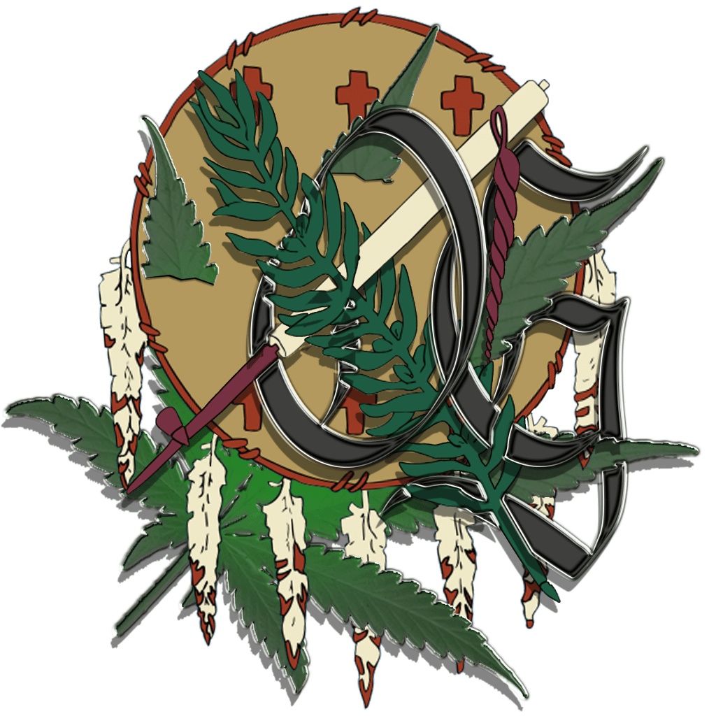
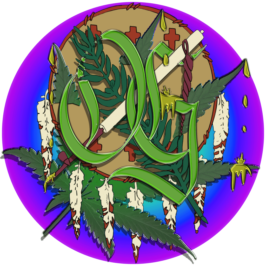
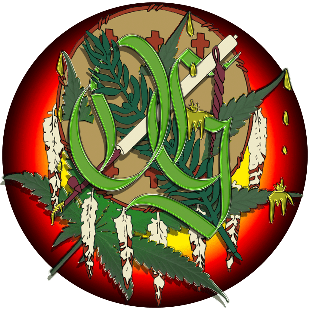
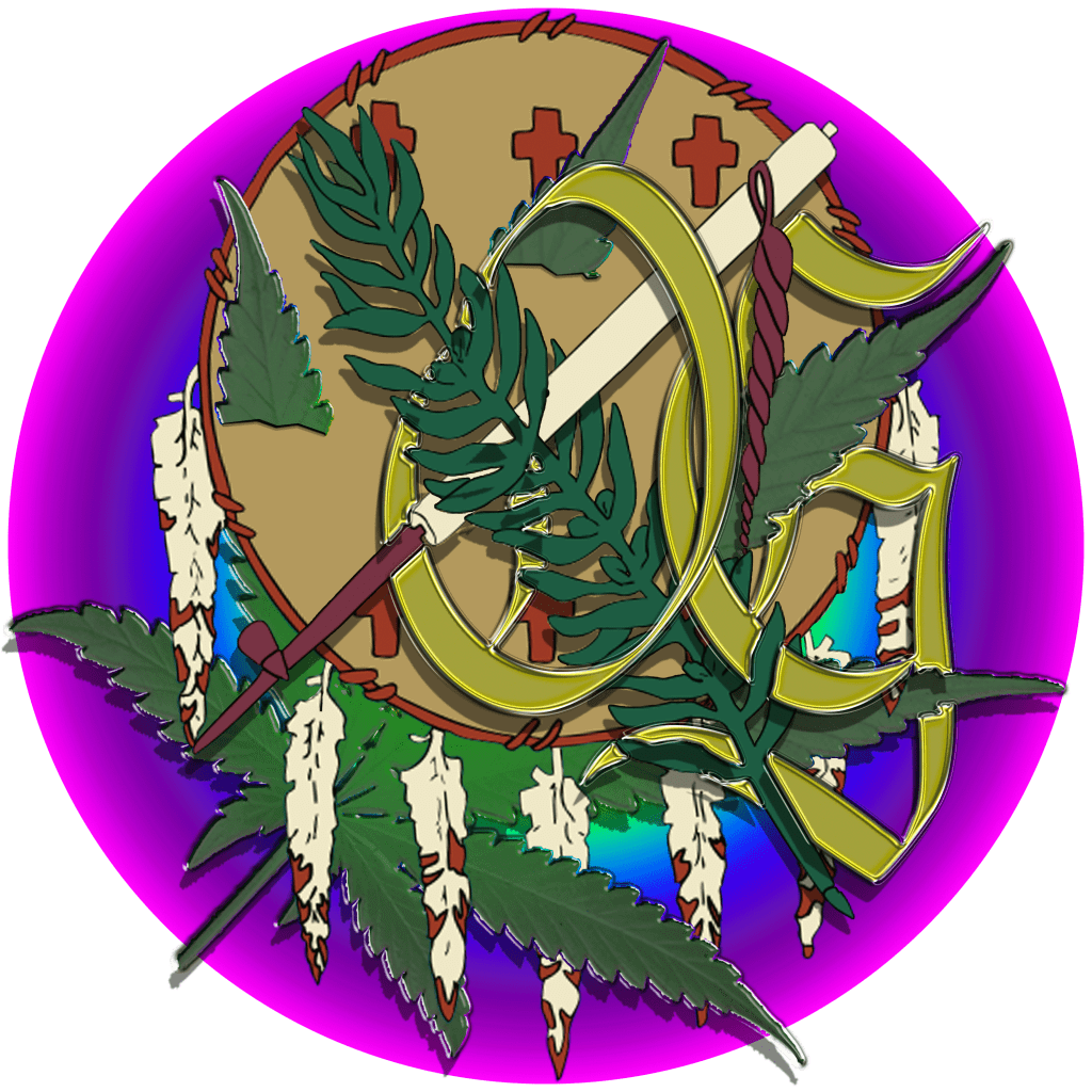
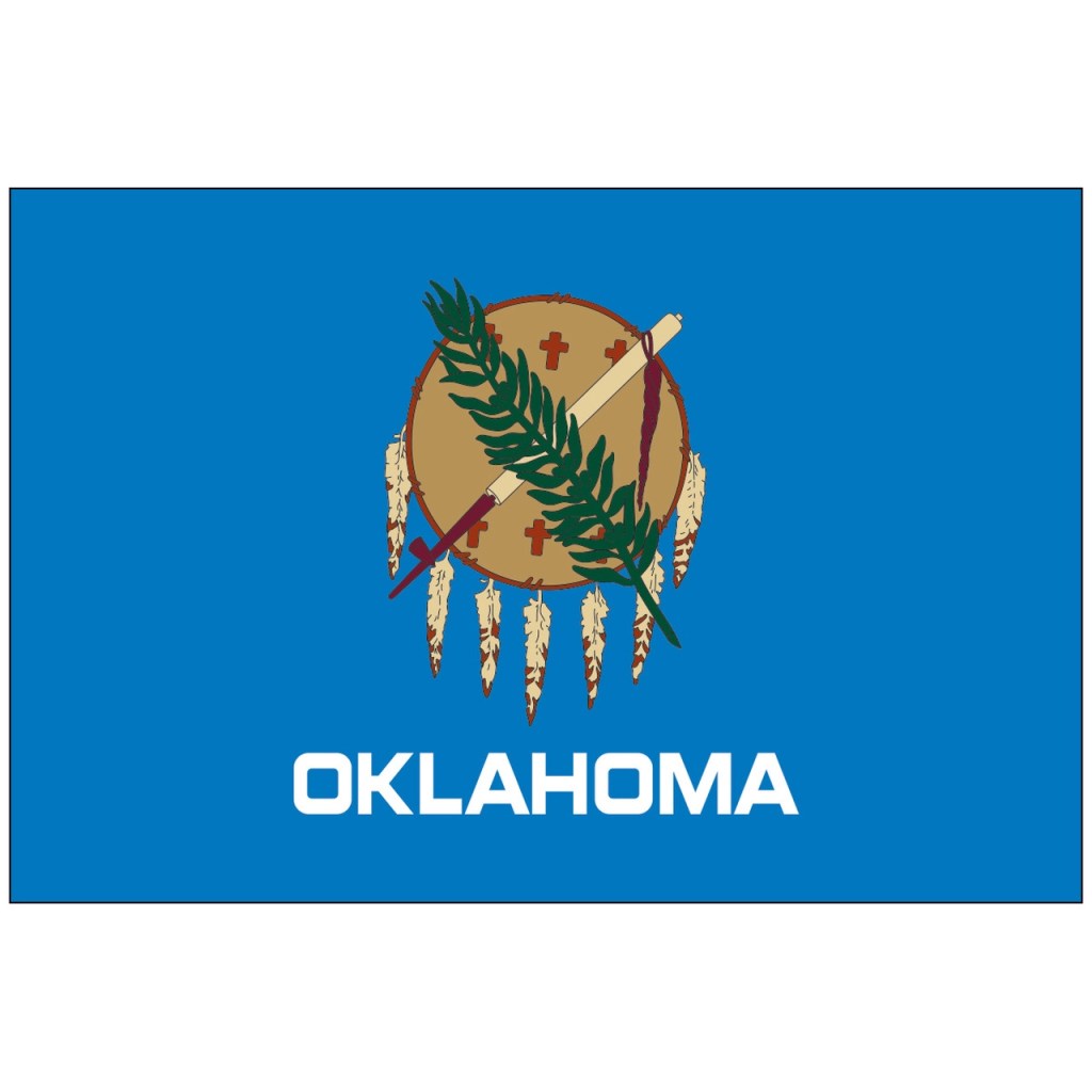
Oki Grow
Oki’s icon comes from the Oklahoma state flag. The flag was a template I used in Photoshop to trace and recreate the parts so I could manipulate each part incorporating the OG, cannabis leaf and dripping rosin.

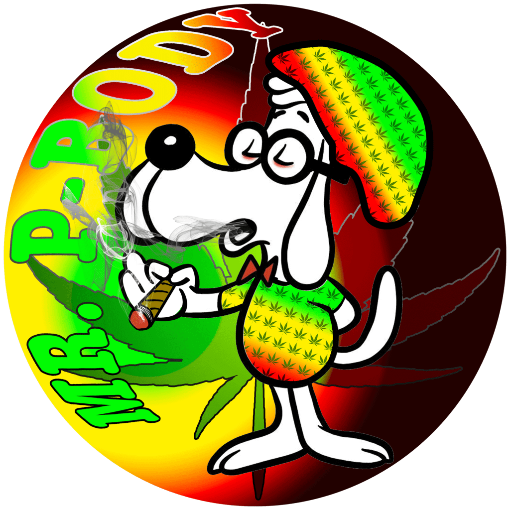
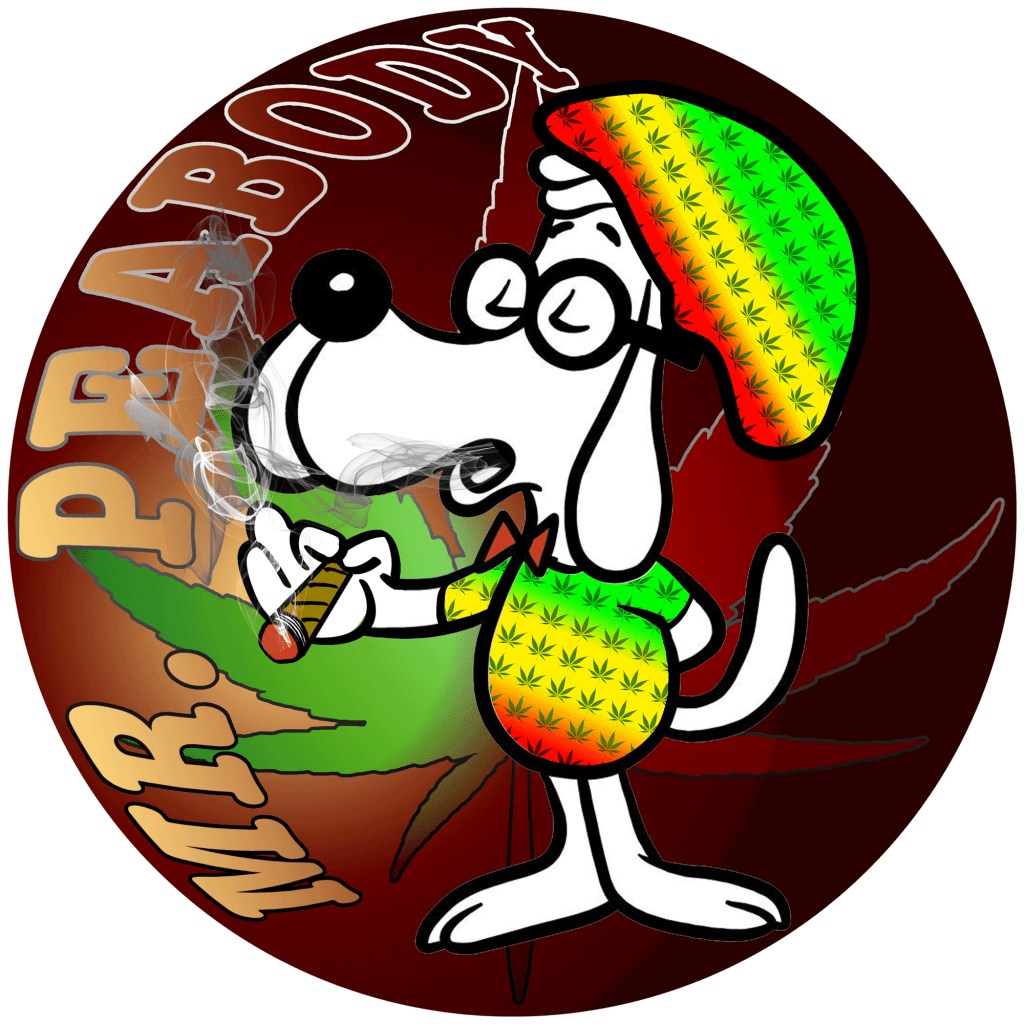
Mr Peabody
Mr Peabody’s icon was a pretty obvious choice, of course he is iconic in his own right as a cartoon. There are an abundance of illustrations on the internet and I used a combination of a couple I found. I had to manipulate the image a bit and I ended up drawing the hand holding the blunt. To dress him up a bit I figured a rasta color theme would be appropriate.

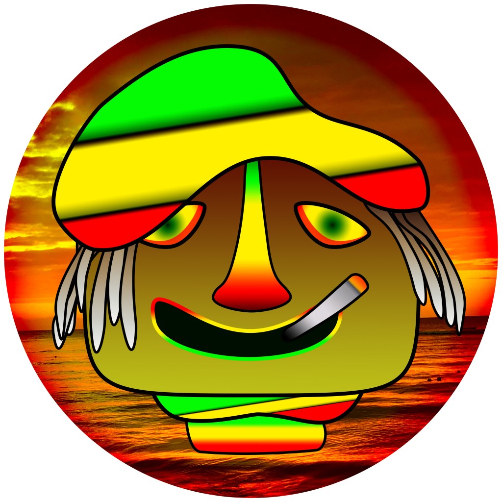
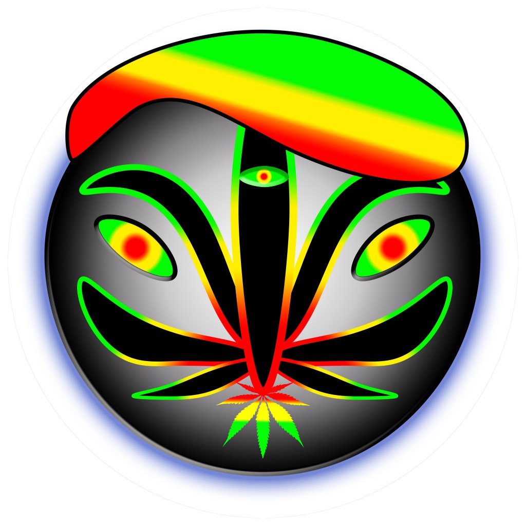
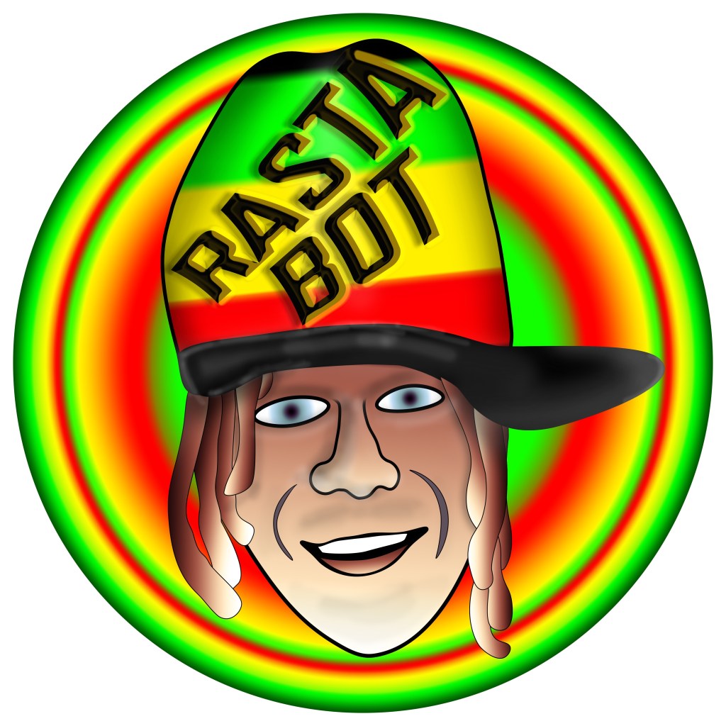
Rasta Bot
The Rasta Bot icon is still a work in progress. The Bot is our server AI intelligence that directs new members to our rules page and will answer certain questions about the site. Initially I thought of creating a simple robot, but sometimes things get over complicated and icons turn into art, so some of these will never be used for that reason, I’ve included some of them here. The icon we’re currently using, is in Rasta Jeffs likeness.


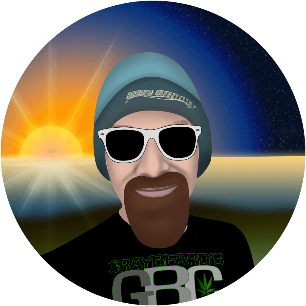
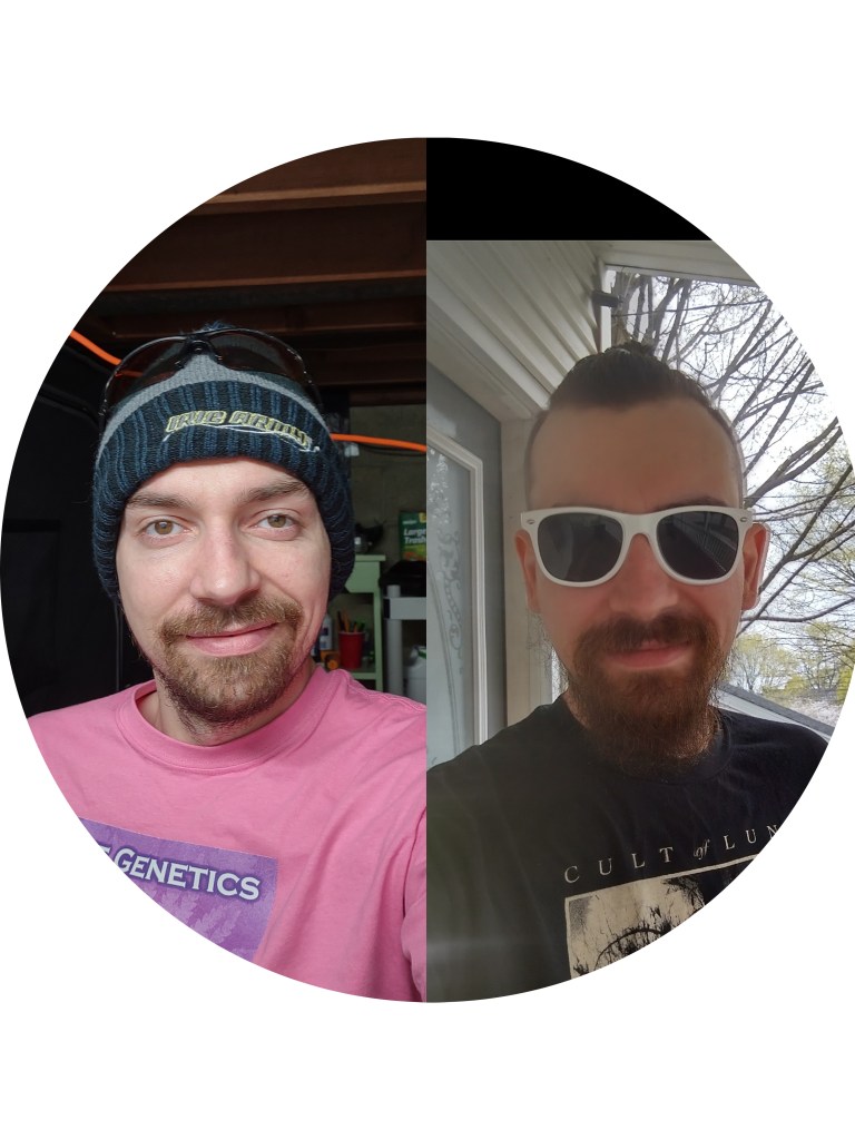
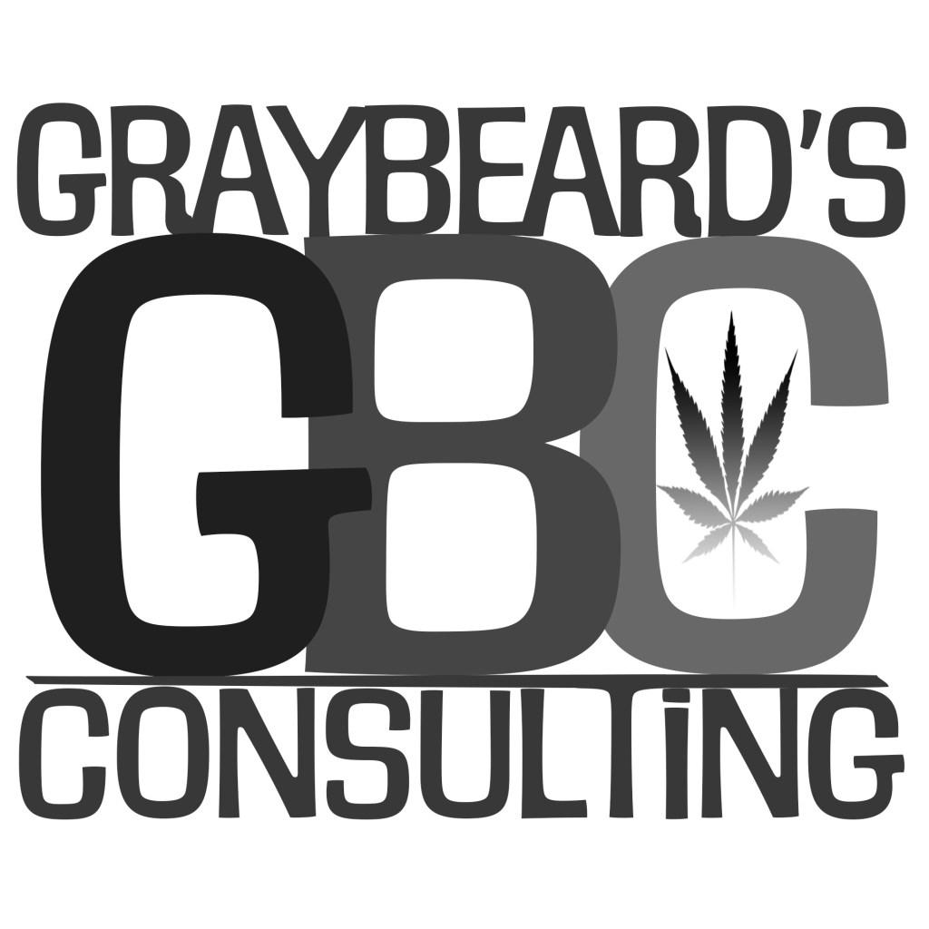
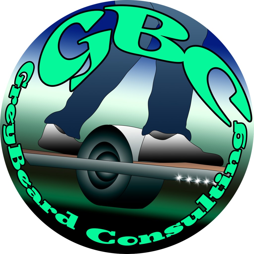
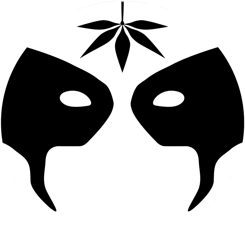
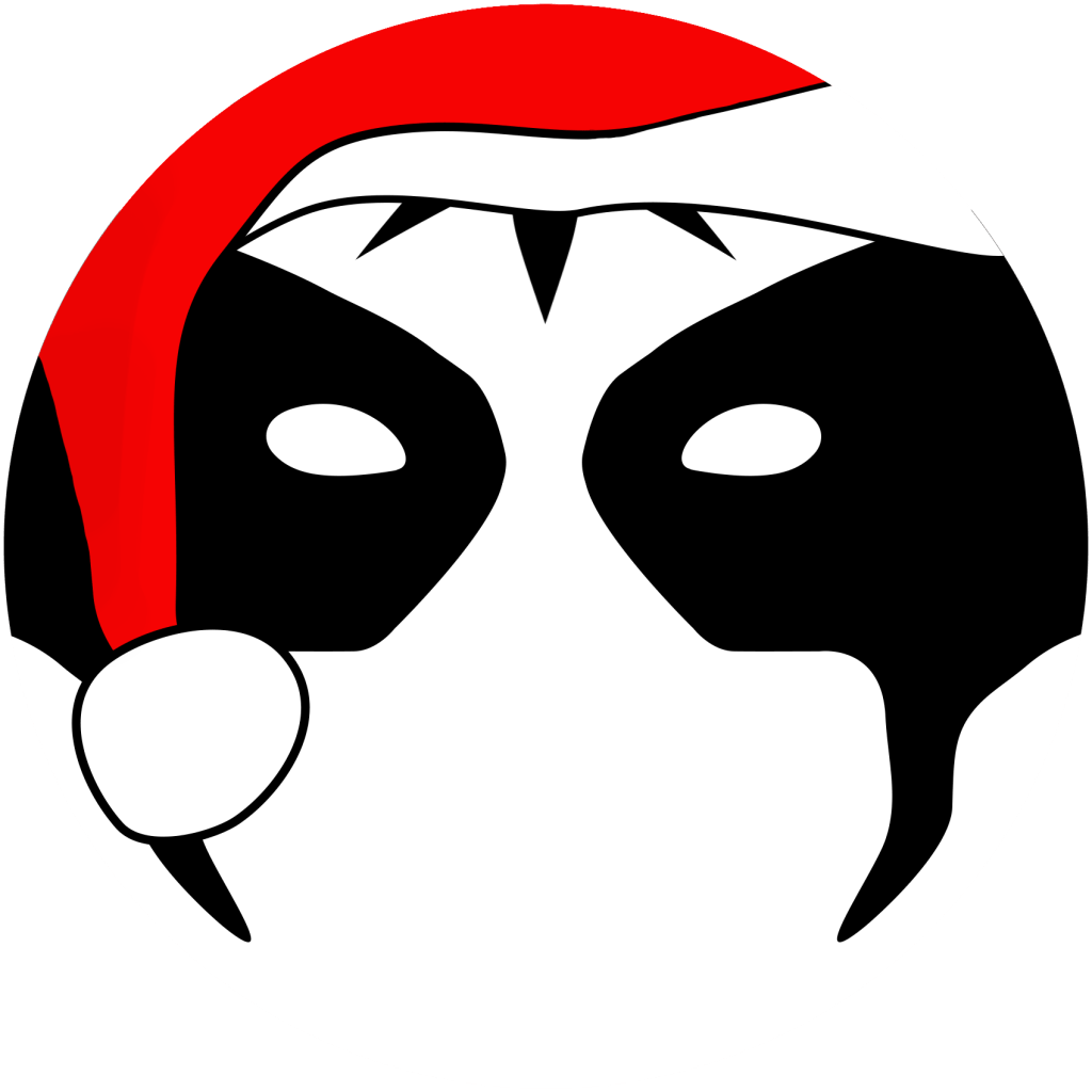
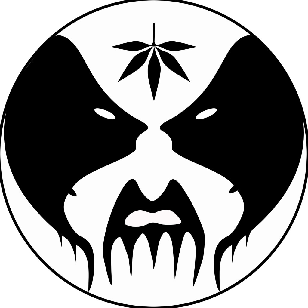
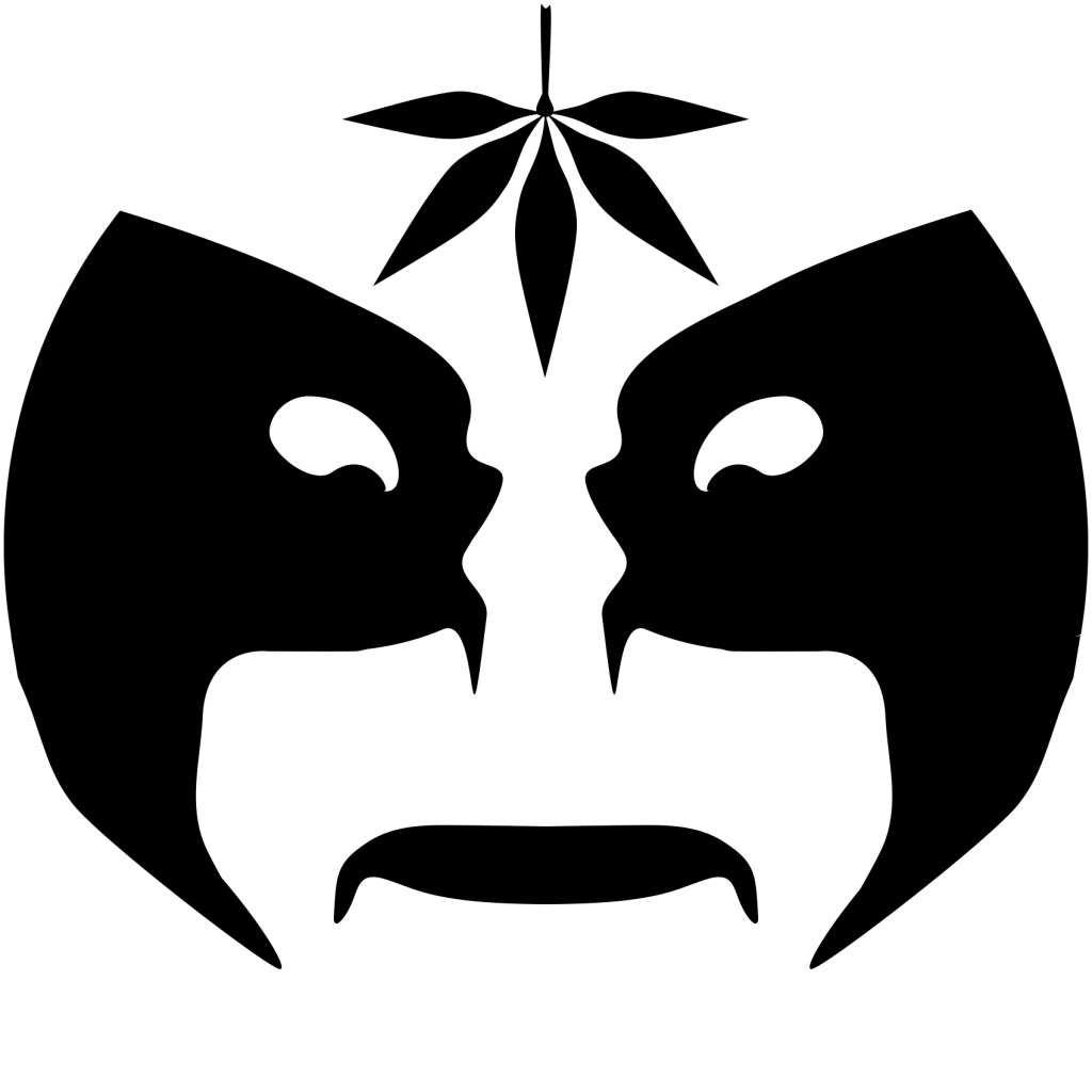
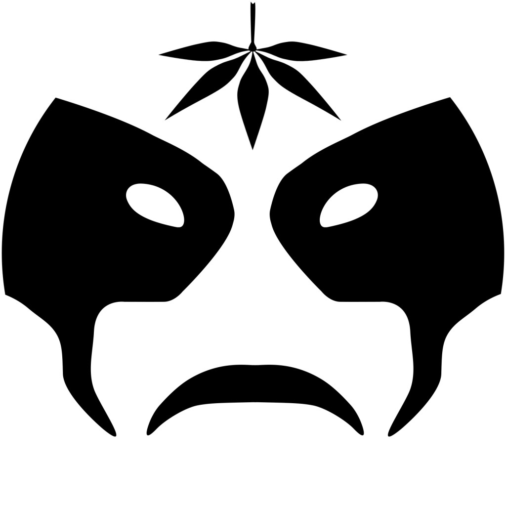
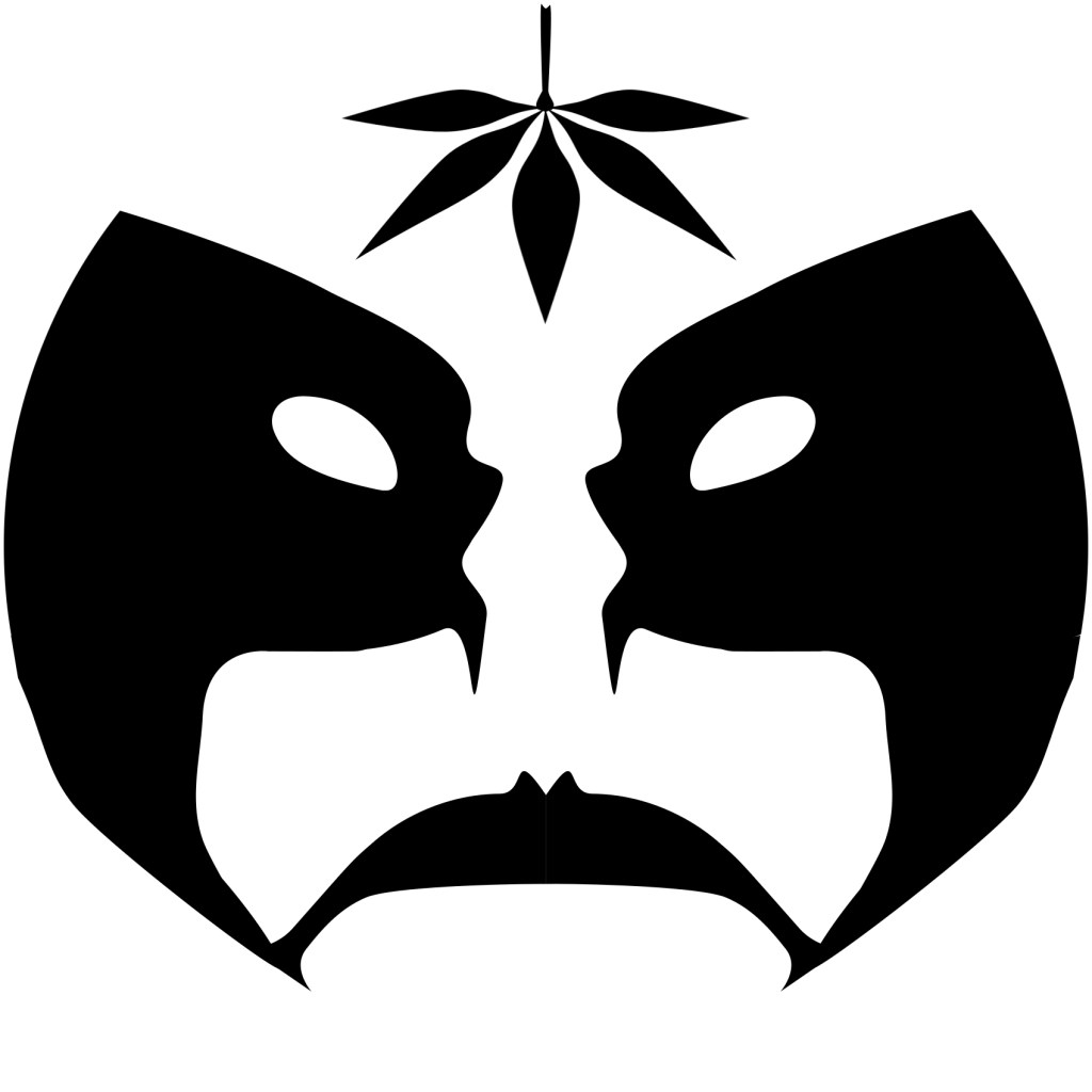
Graybeard
Graybeard’s original icon is based on corpse paint for black metal bands. I did’t know much about this so Graybeard educated me and gave me lots of reference material to go by. The avatar went through many changes and continues to evolve throughout time. I really liked playing with just the black and white aspect and the interplay with multiple faces within faces. Graybeard started a new consulting business and I helped him with his new logo he wanted for business cards or icons, there were many designs playing with the text and colors, the one wheel design was dropped, although I kinda liked it so I included it here. His caricature was derived from the two photos below and I incorporated his new icon on his shirt.

Billy Podunk
Billy wanted a simple Alaska type theme and it went through a few iterations before settling on the cannabis leaf over the paw print. Billy’s caricature was derived from his photo below, I also made a video that shows my whole process of creating this, click on the photo for a link to the video or click this link https://youtu.be/w8-N3S-mthY


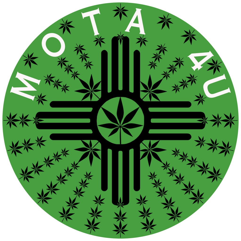
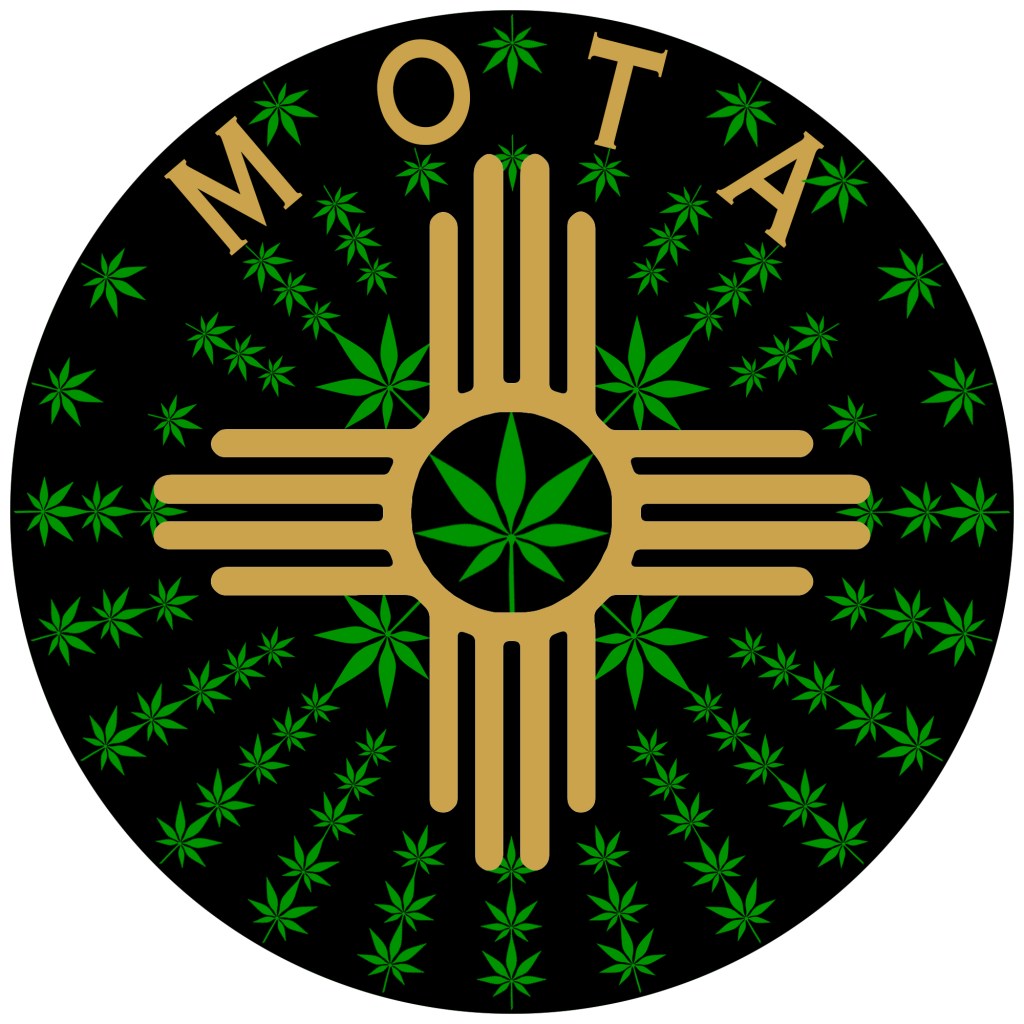
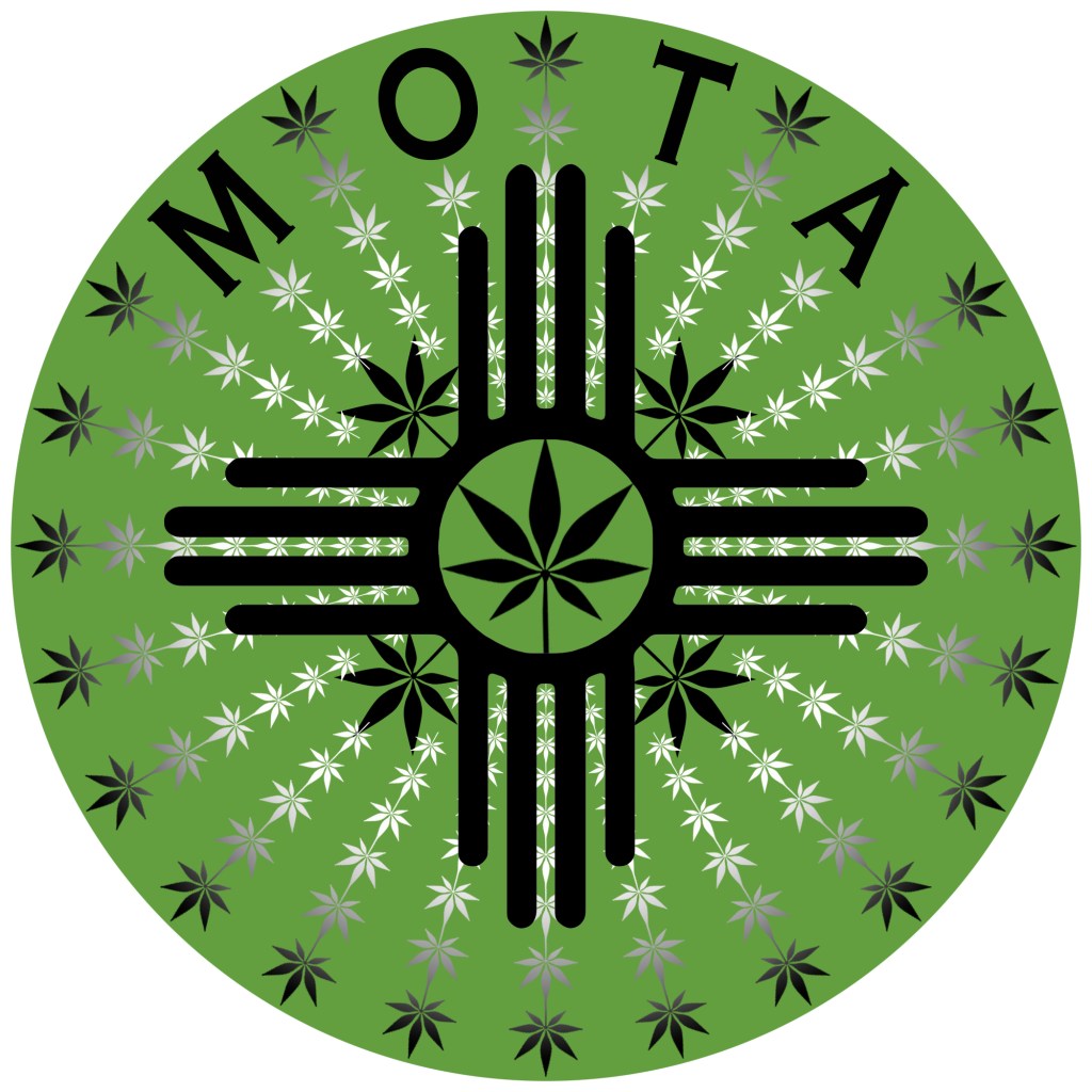
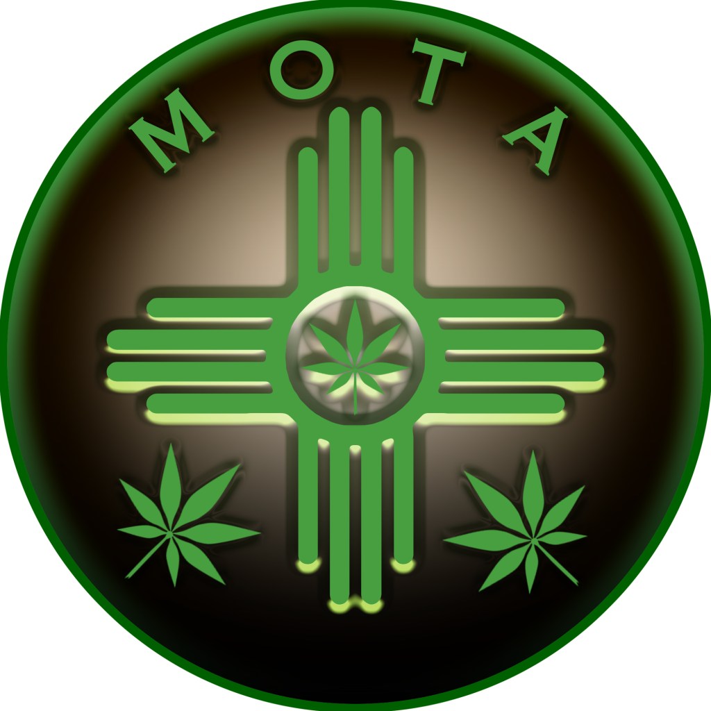
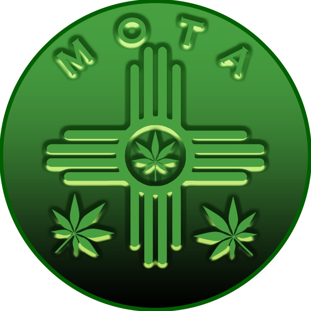
Mota 4U
Mota’ s icon is based on his military service to his country, his online handle “Mota 4U”, and his love for growing and using cannabis for his medication. Mota’s new icon comes from the New Mexico flag’s icon, incorporating cannabis leafs.

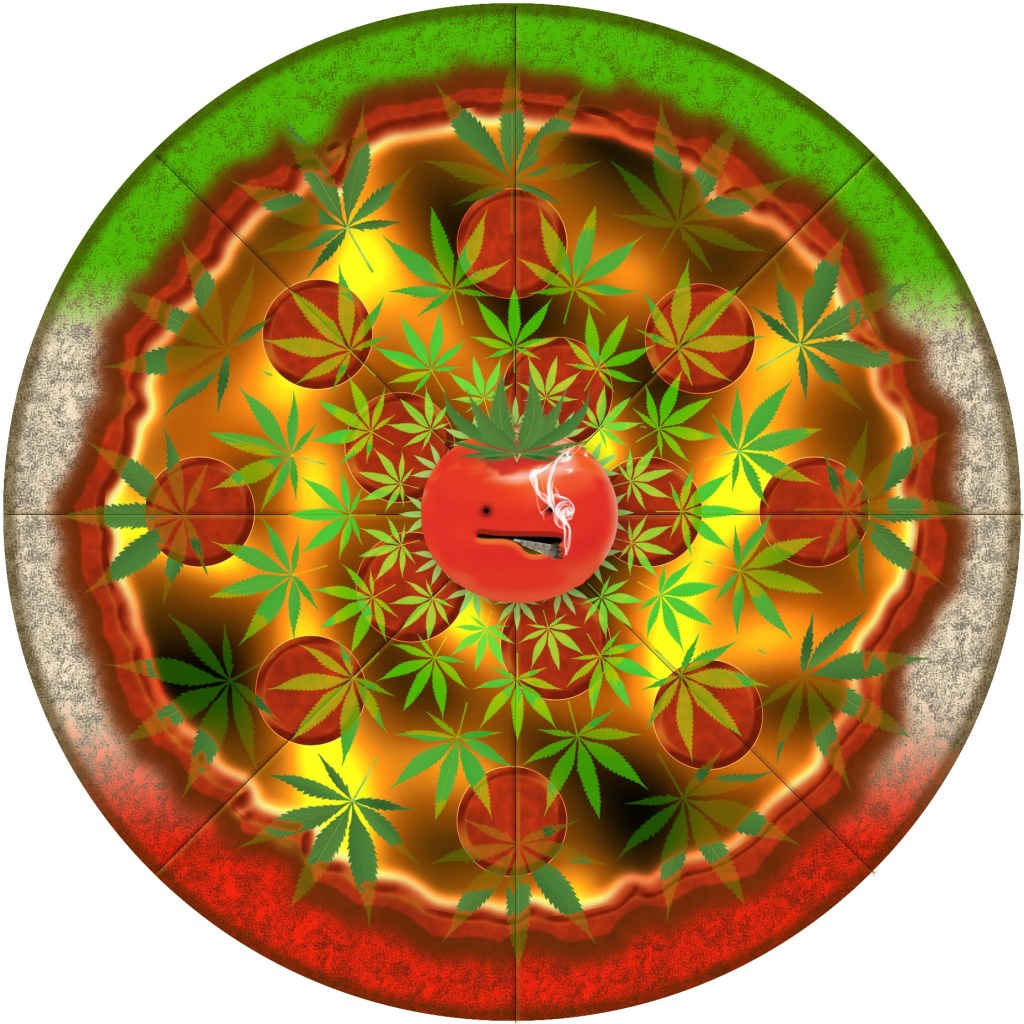
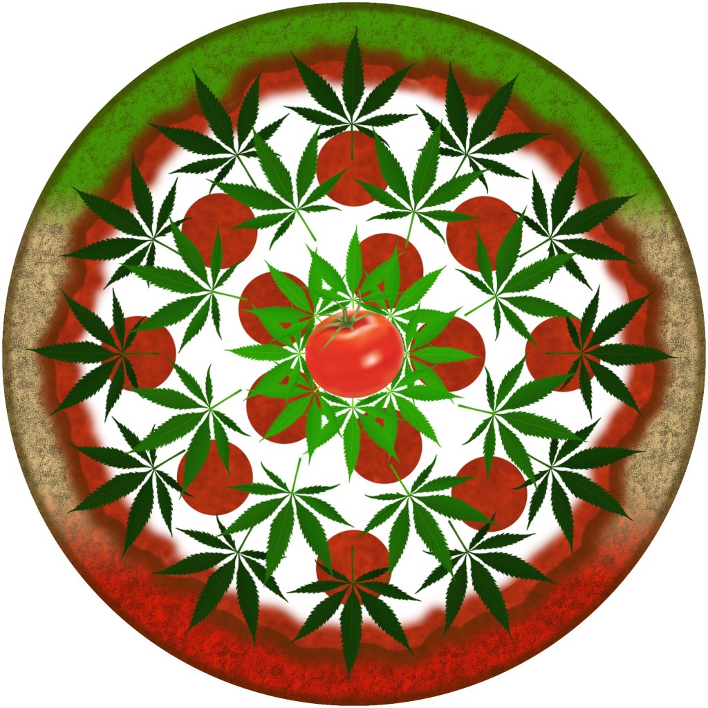
Irie Grower
Irie’s icon is based on his love of Italian food, tomatoes and cannabis. There were only a couple of iterations before settling on the simple pizza pie.

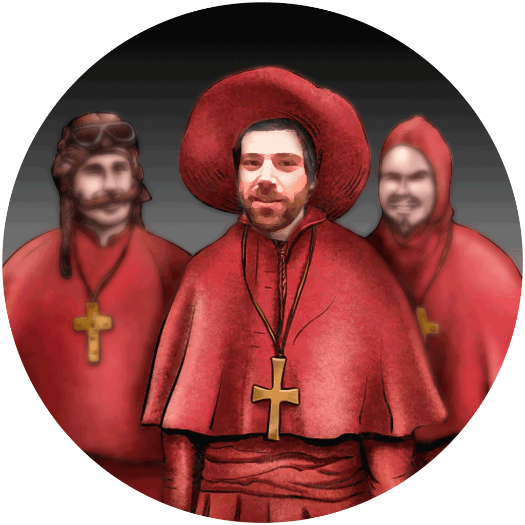
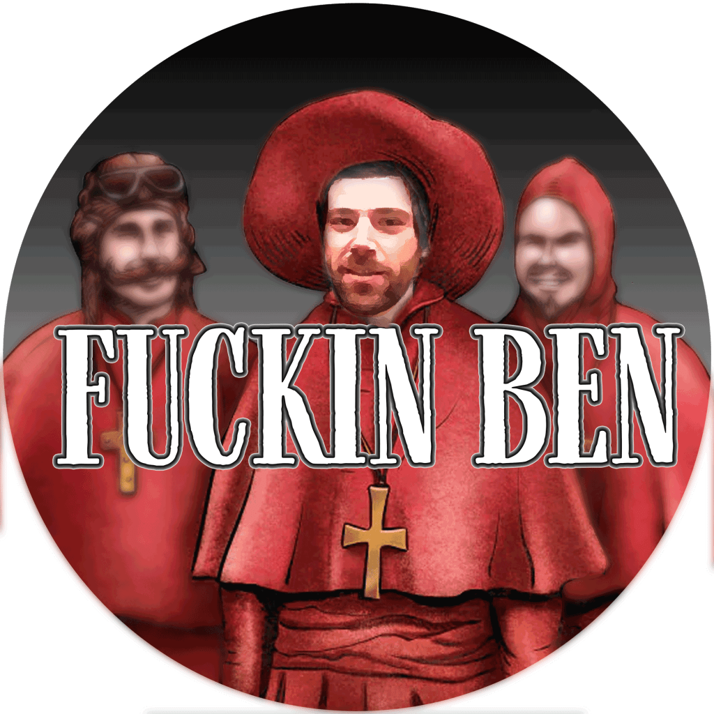
*ucking Ben
This icon was based on Monty Python’s Spanish Inquisition, Ben’s image was from a screen shot with low resolution which worked for a small icon, *ucking Ben! hahaha
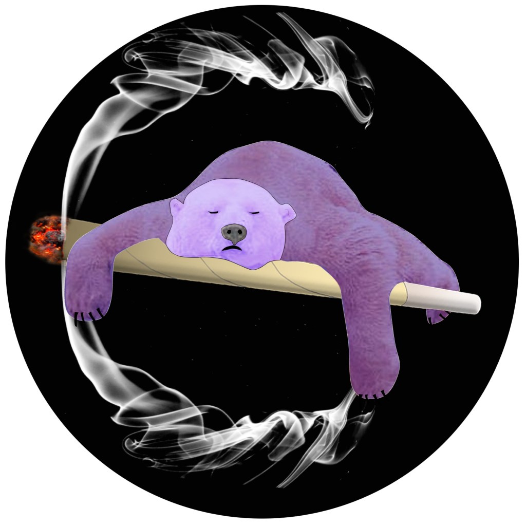
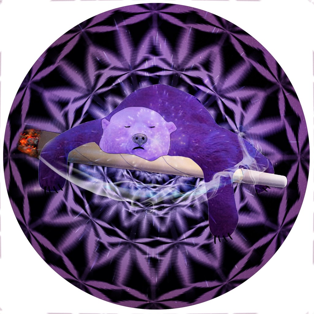
JordanPerks
Jordan wanted a purple sleeping bear smoking a blunt, so I found an image of this bear and I redrew it to fit on top of a joint rather then the bear smoking. It seemed to work so the background was played with a bit.

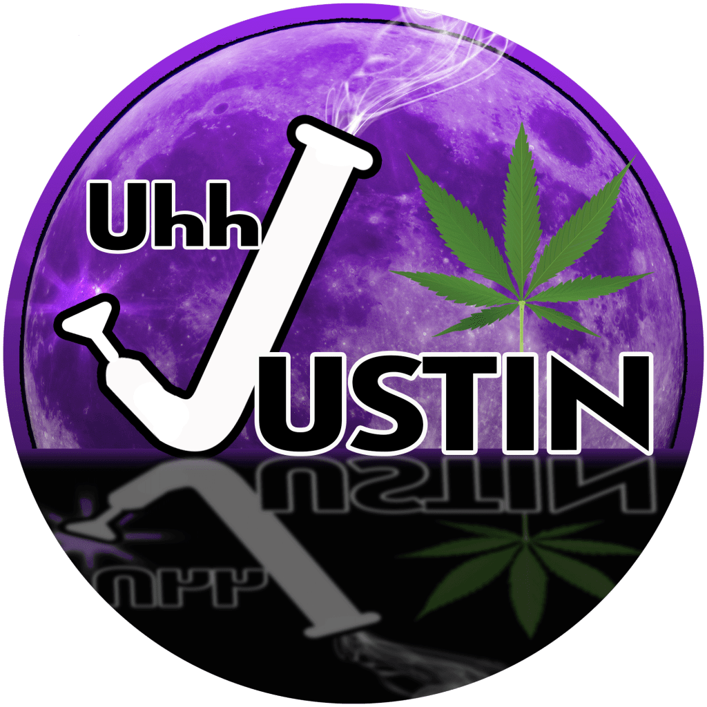
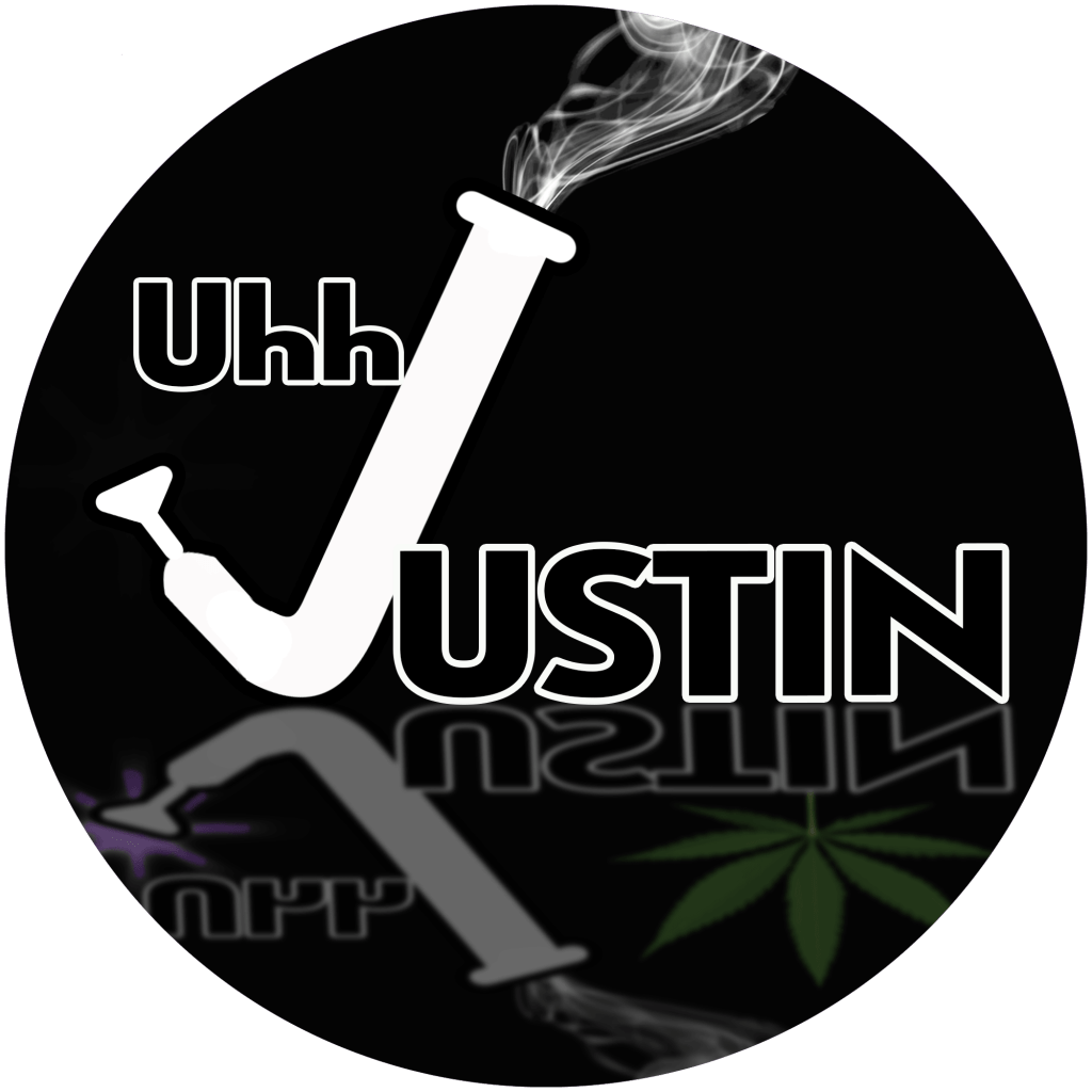
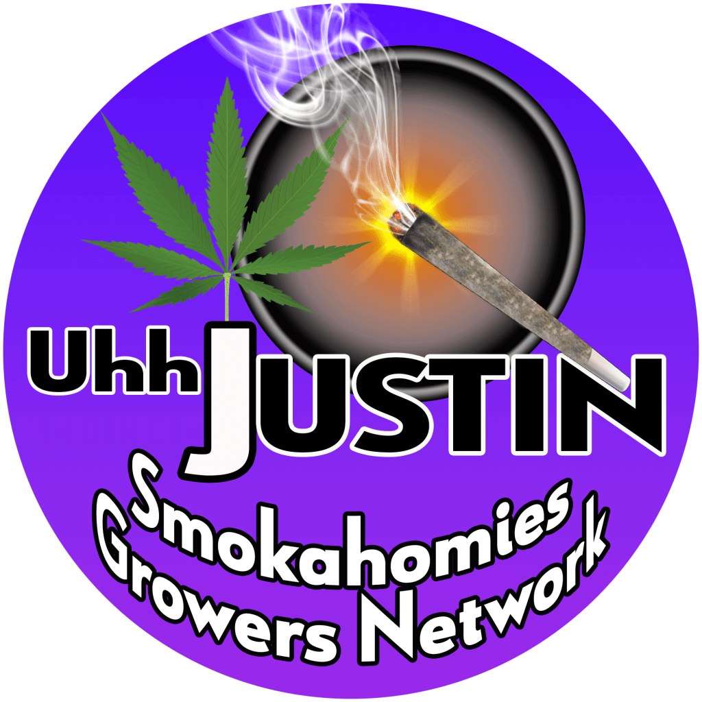
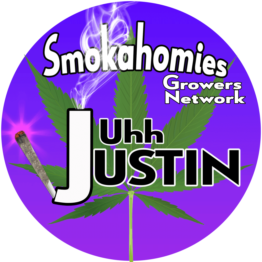
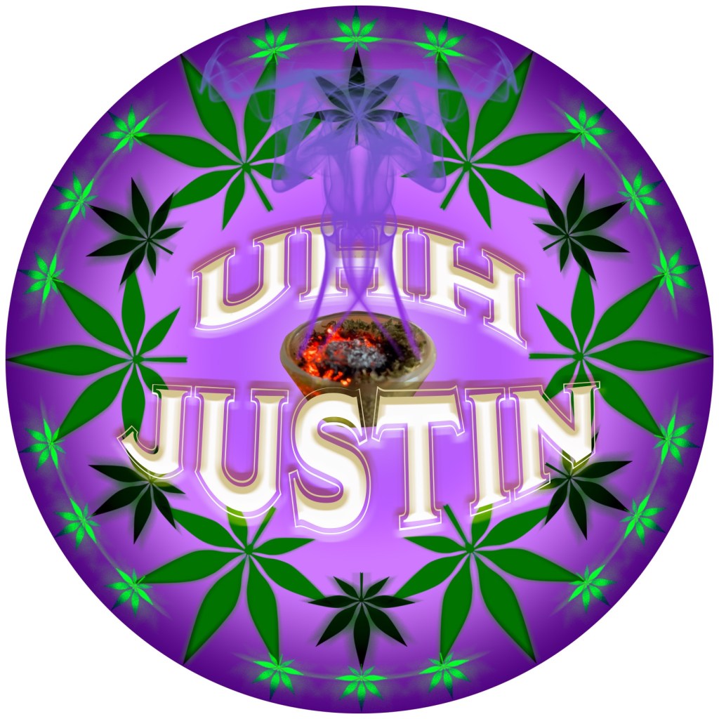
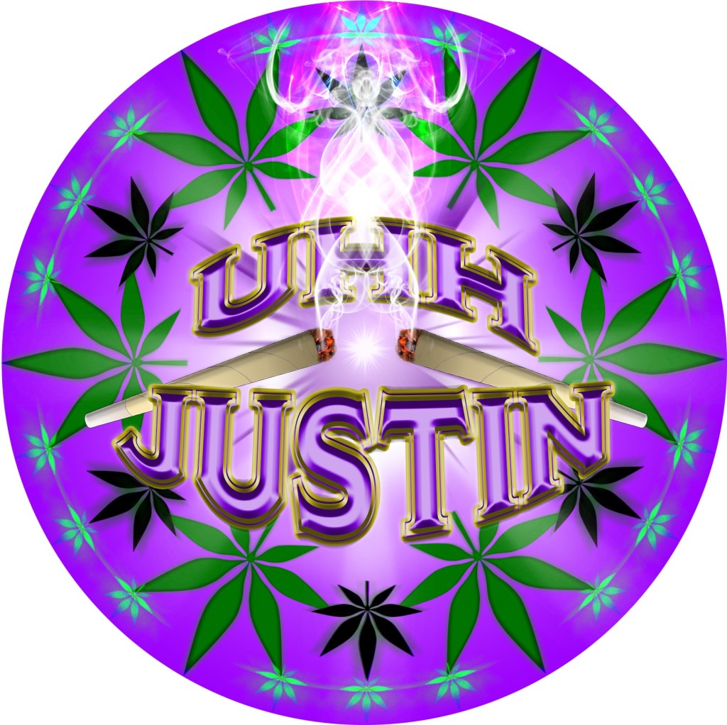
UhhJustin
Justin wanted something purple using his online handle “UhhJustin” and a cannabis leaf or leaves. Justin’s new icon kinda happened by accident when I realized the Capital J looked like it could become a bong. He also started a new discord community called Smokahomies Growers Network.
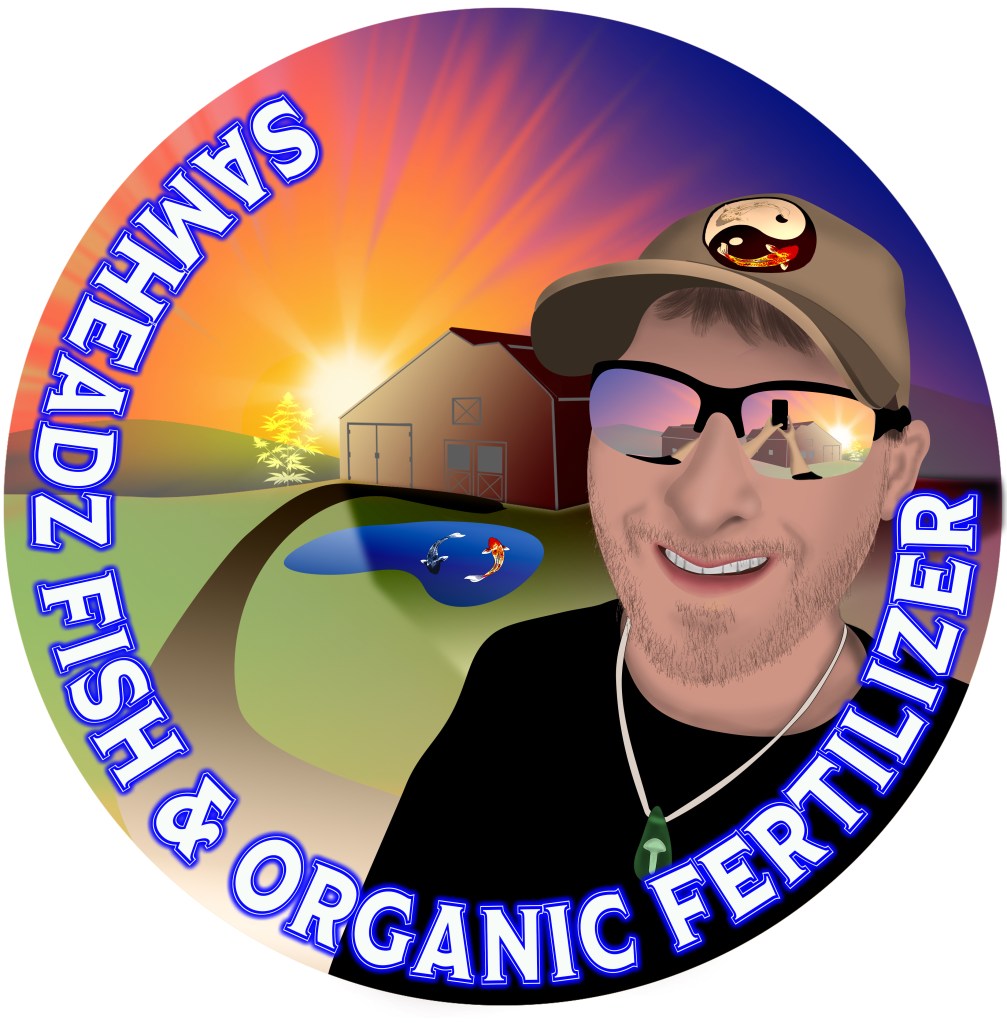
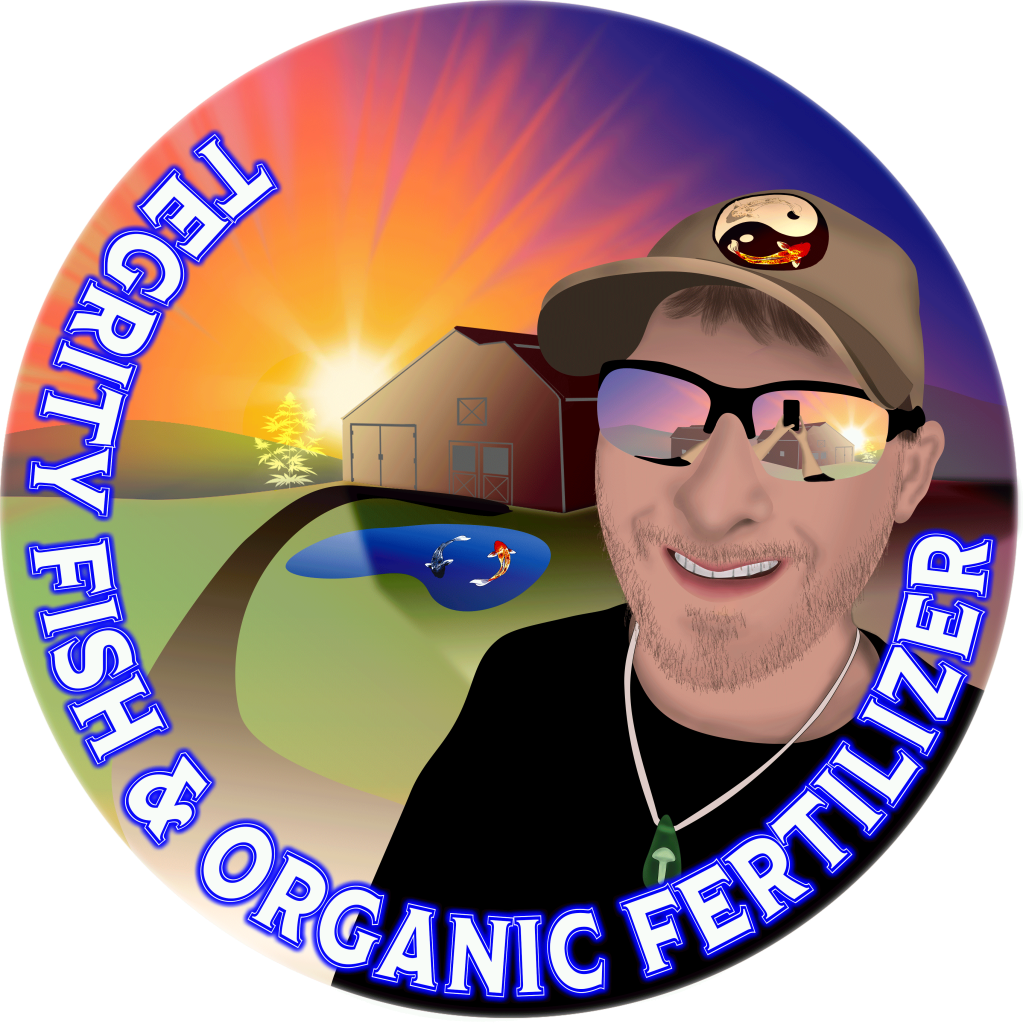
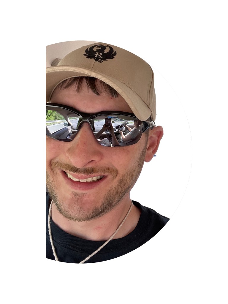
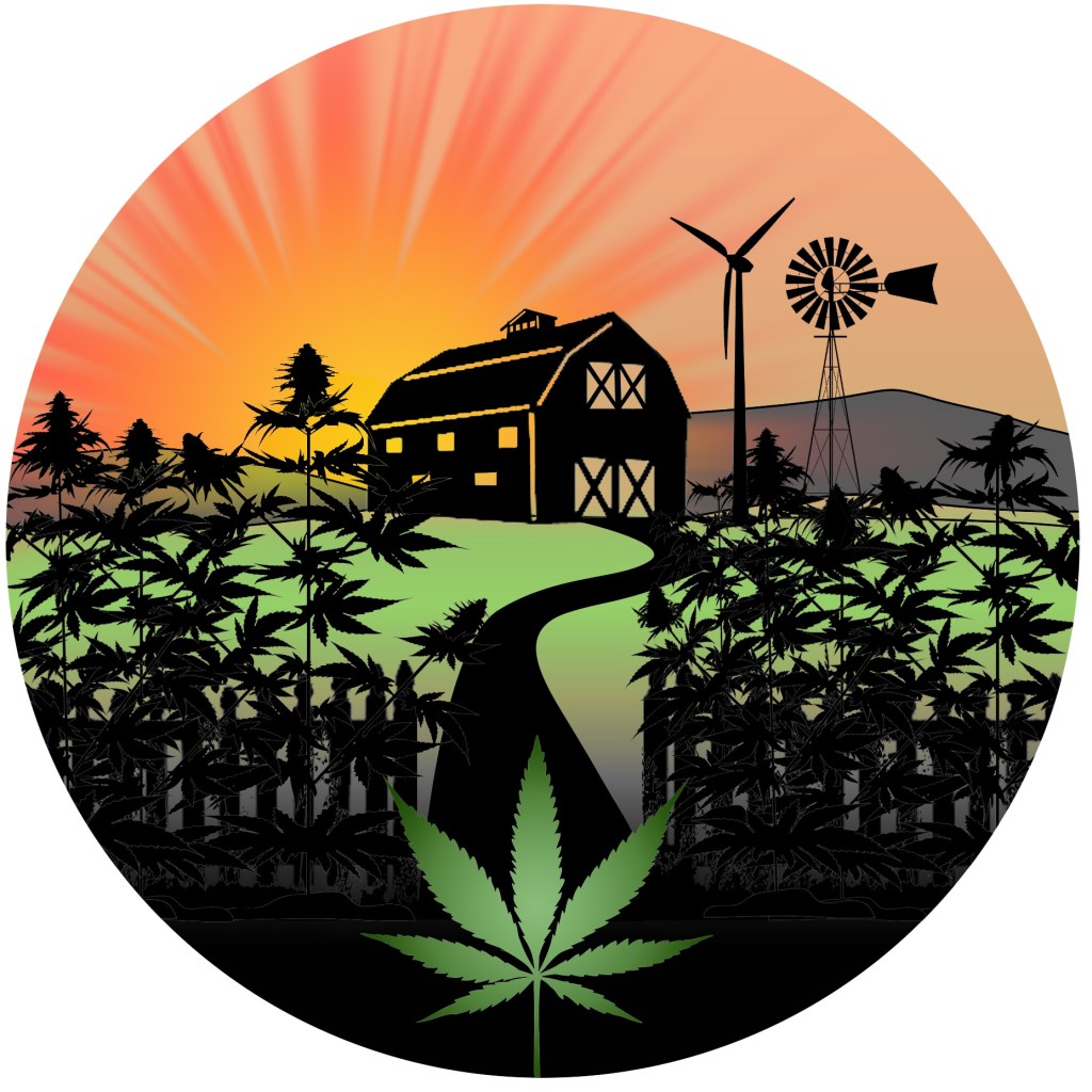
SamHeadz
Sam’s icon was a lot of fun to play with because of the multiple items he wanted to try to incorporate. He wanted an image of his specific barn; which he sent me a photo of a painting of the barn, cannabis, mushrooms, a “U” shaped driveway, the surrounding hills, his dog or old icon and the chemical symbols for THC and psilocybin. This didn’t happen all at once, this icon actually derived from another project for Lollipop Farm (See Next). The following are images through multiple design stages. Sam settled on the last icon for now as This is still a work in progress. The newest design uses a Photo of Sam to create his caricature incorporating parts of other designs I’ve done for Sam.


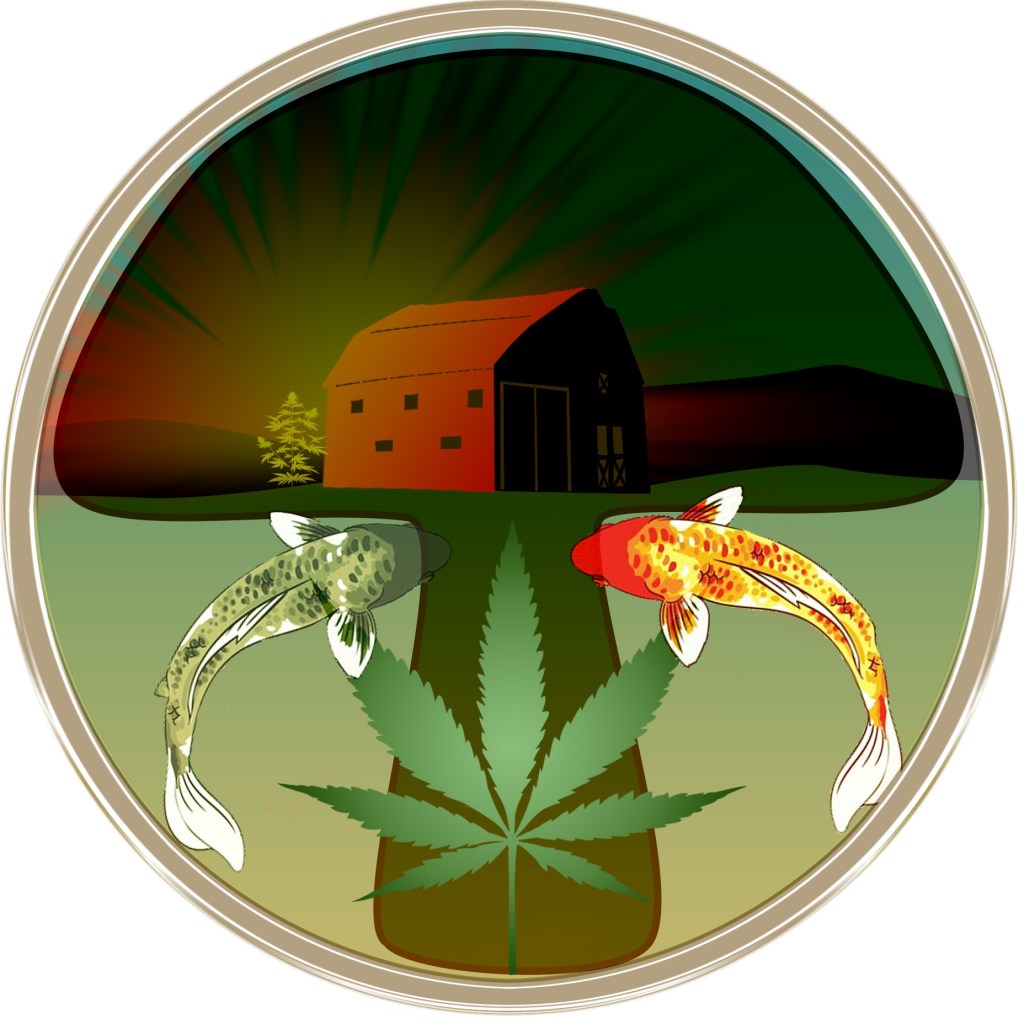


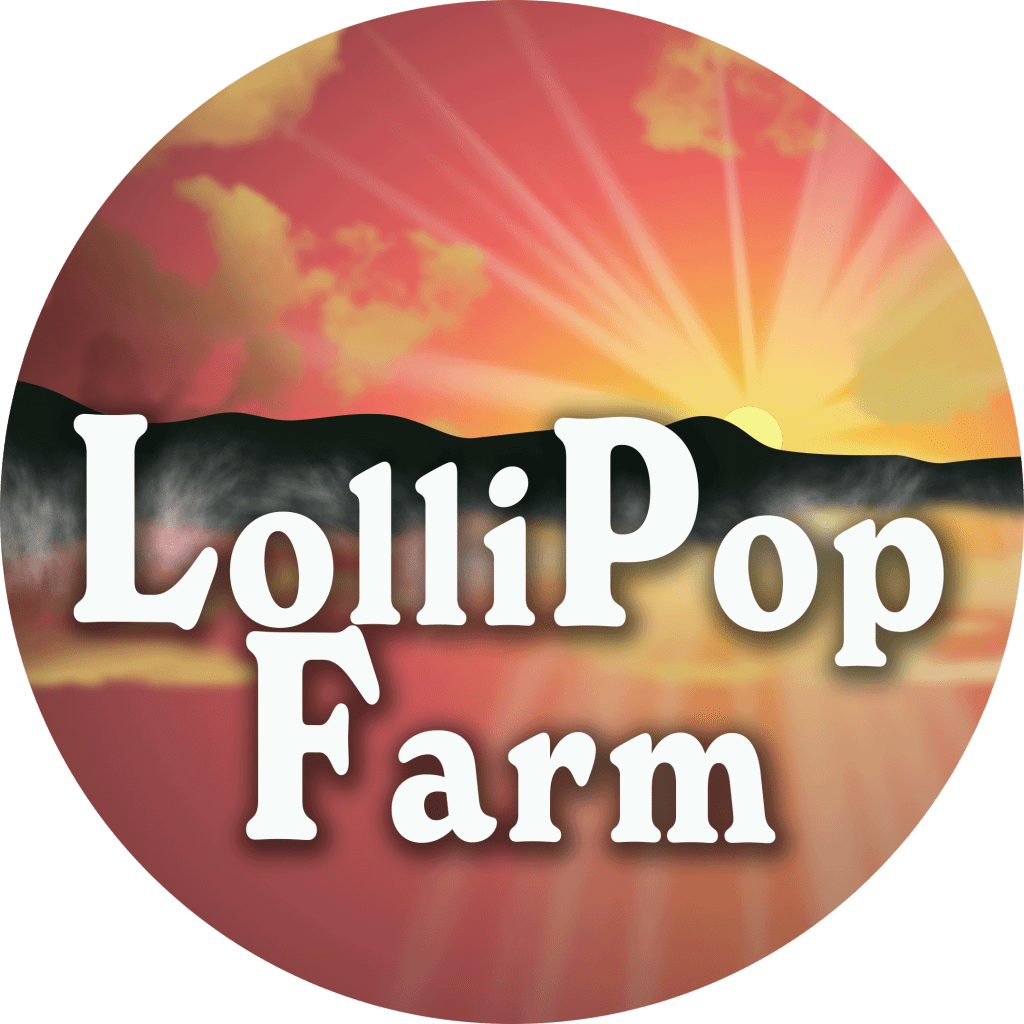
Lollipop Farm
LolliPop Farm’s icon was born out of the poster I was making for Dankstock which will be held at LolliPop farm. I originally made the monochrome version which was used in SamHead’s icon above. The Homegrown for heroes was a request and was created from a screenshot as shown.


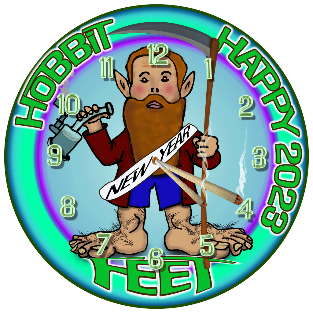
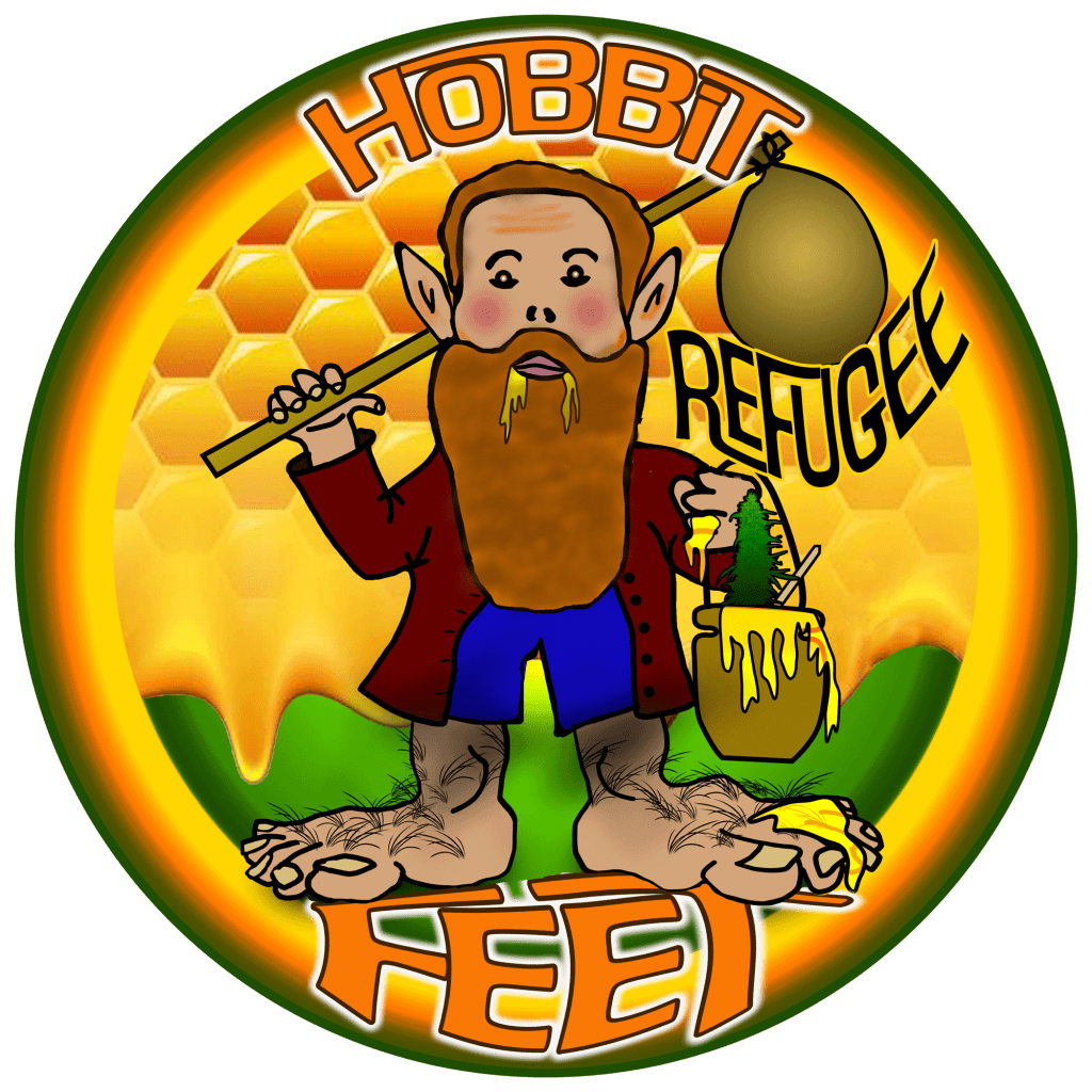
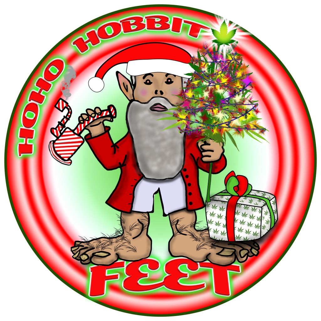
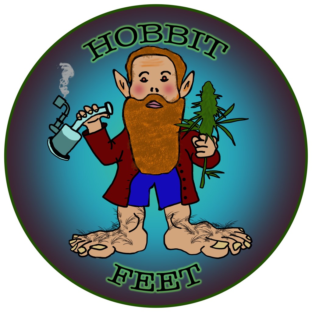
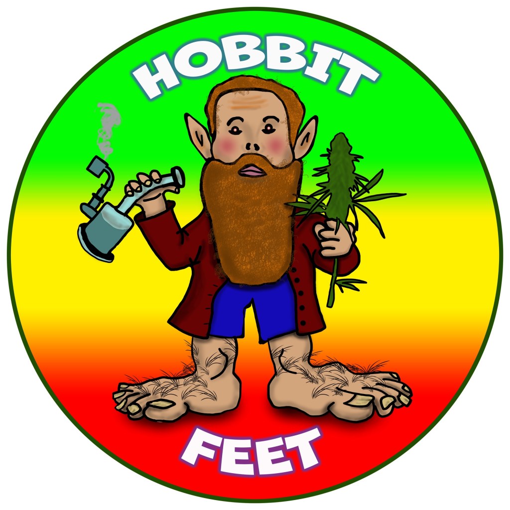
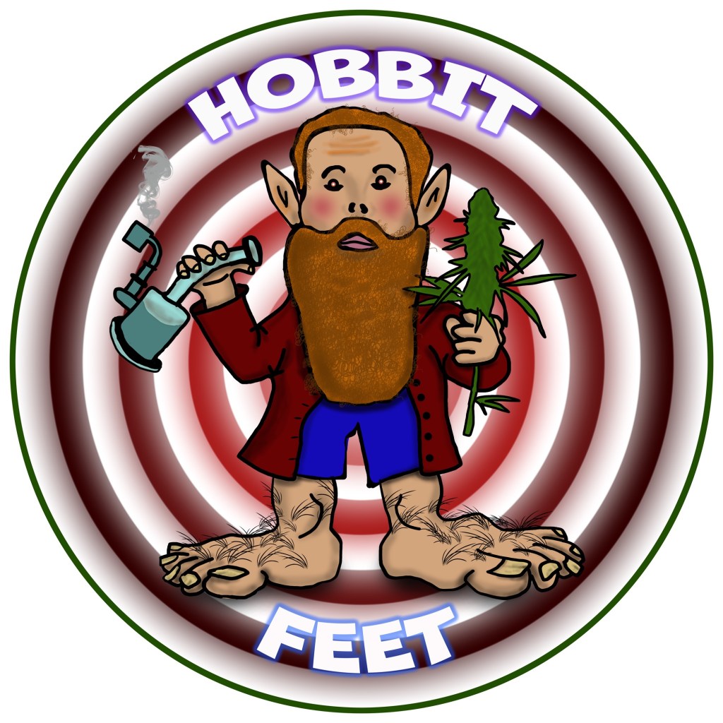
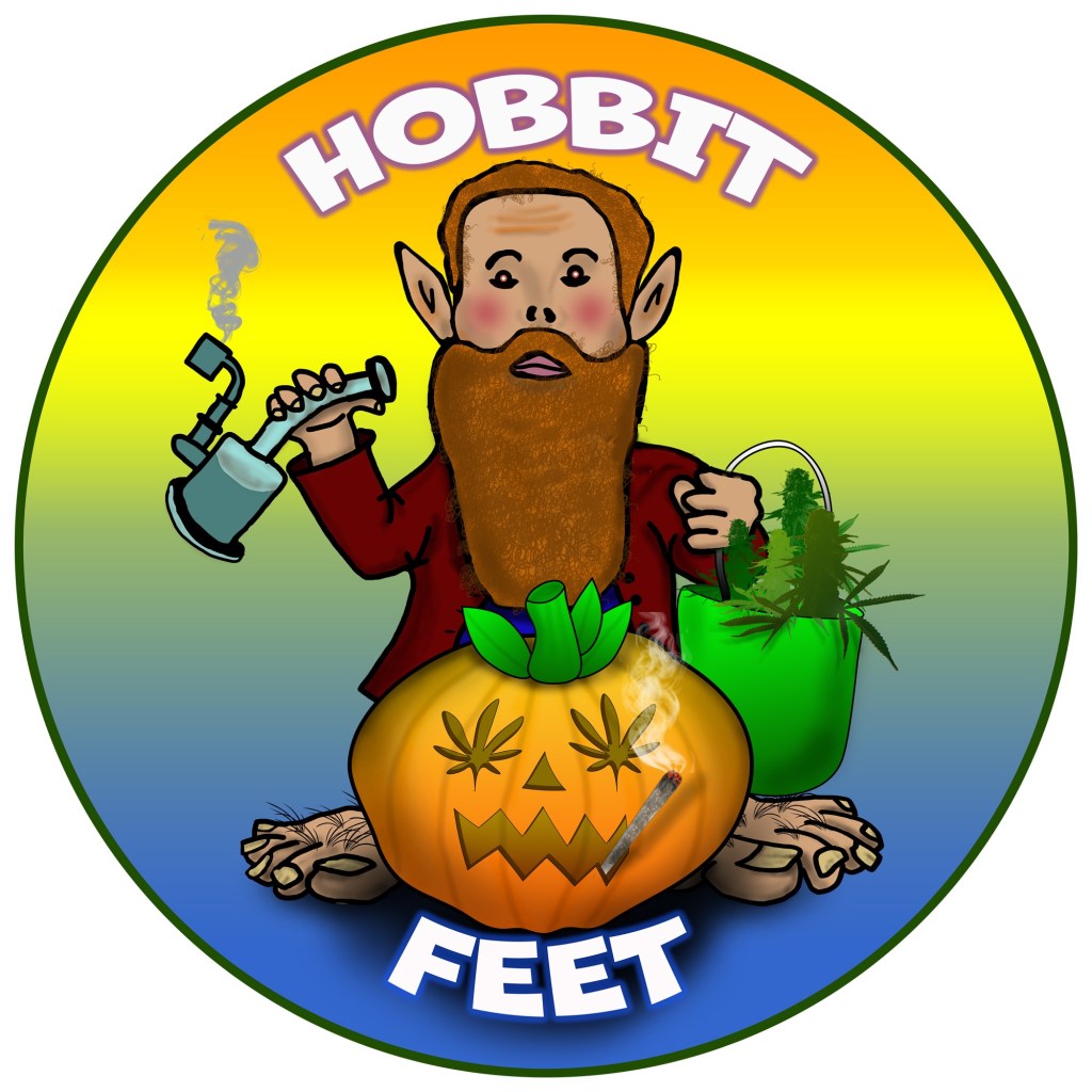
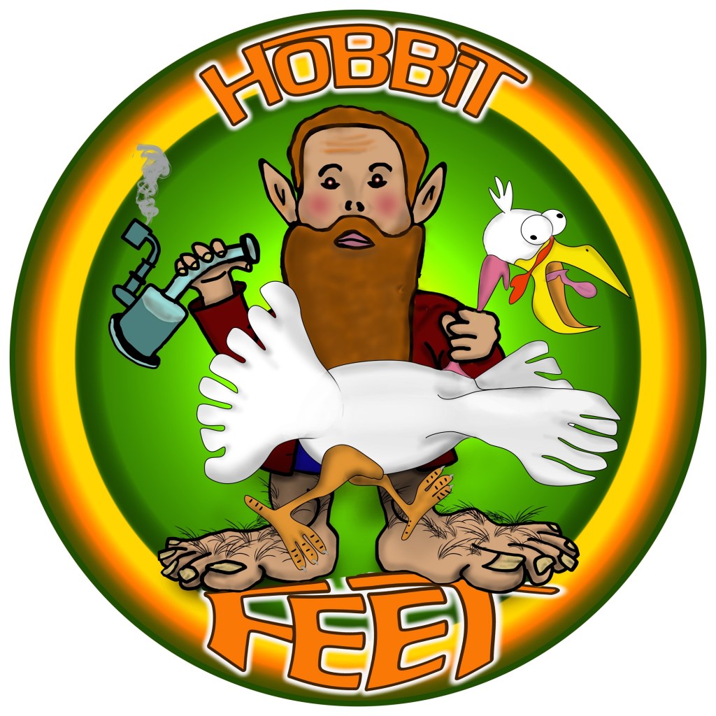
Hobbit Feet
This icon was fairly self explanatory and was a lot of fun to create. I usually don’t draw characters because I’m more of a technical artist but I thought I’d give it a try. I did use some reference material for this image but the entire image was drawn by my hand using a mouse with Photoshop. I actually used a screen shot of hobbit, which was pretty grainy, to get the icon to look similar to his likeness. I plan on updating this icon frequently because Hobbit would like some holiday inspired work.


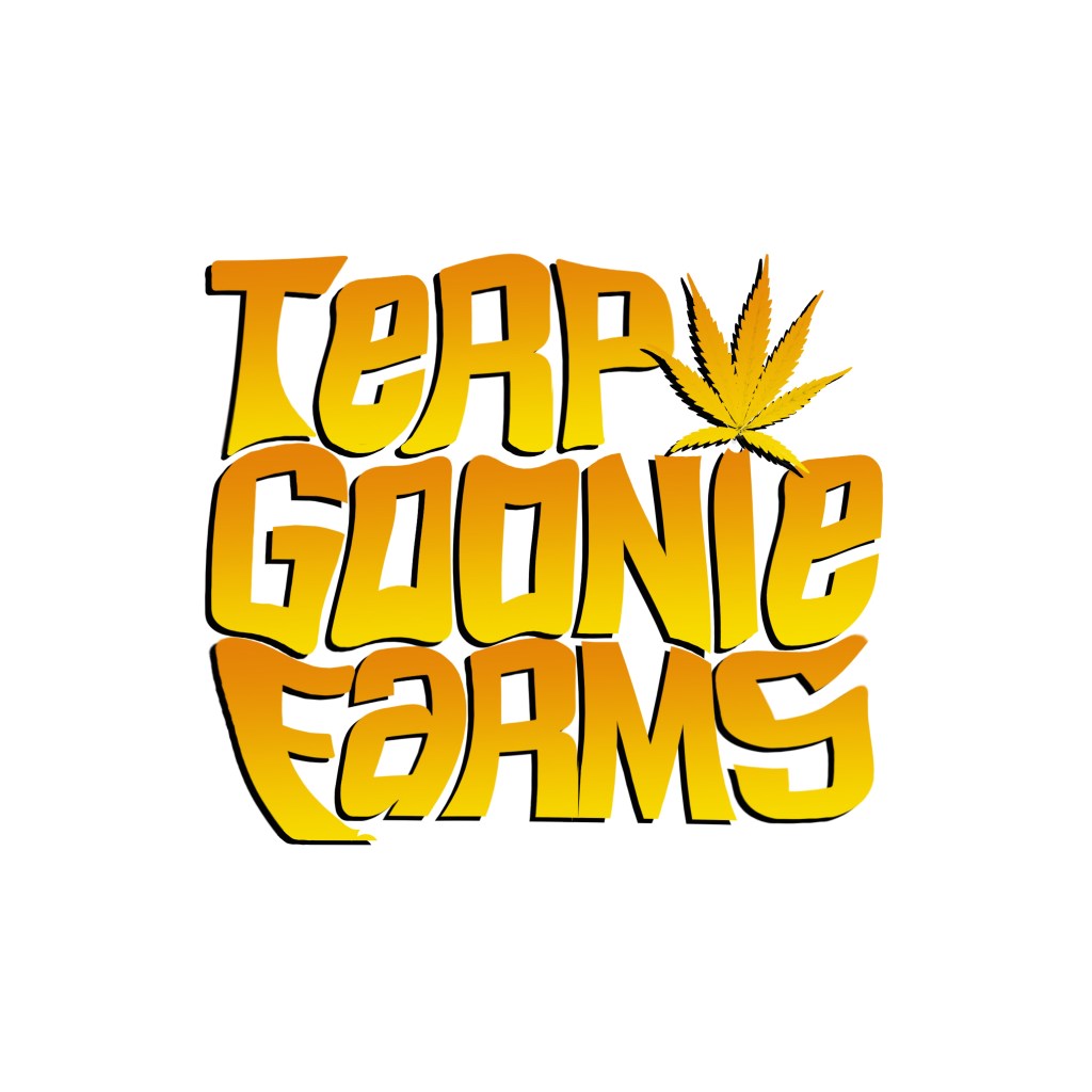
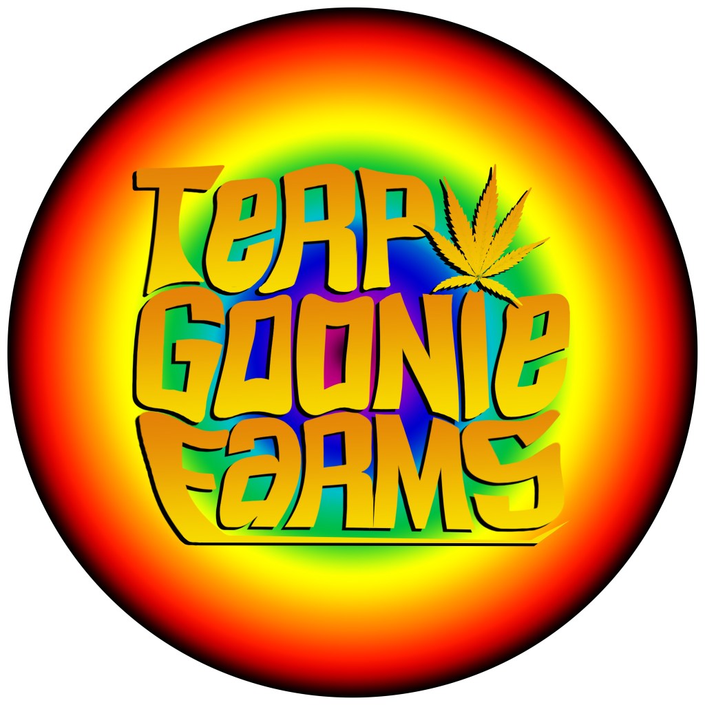
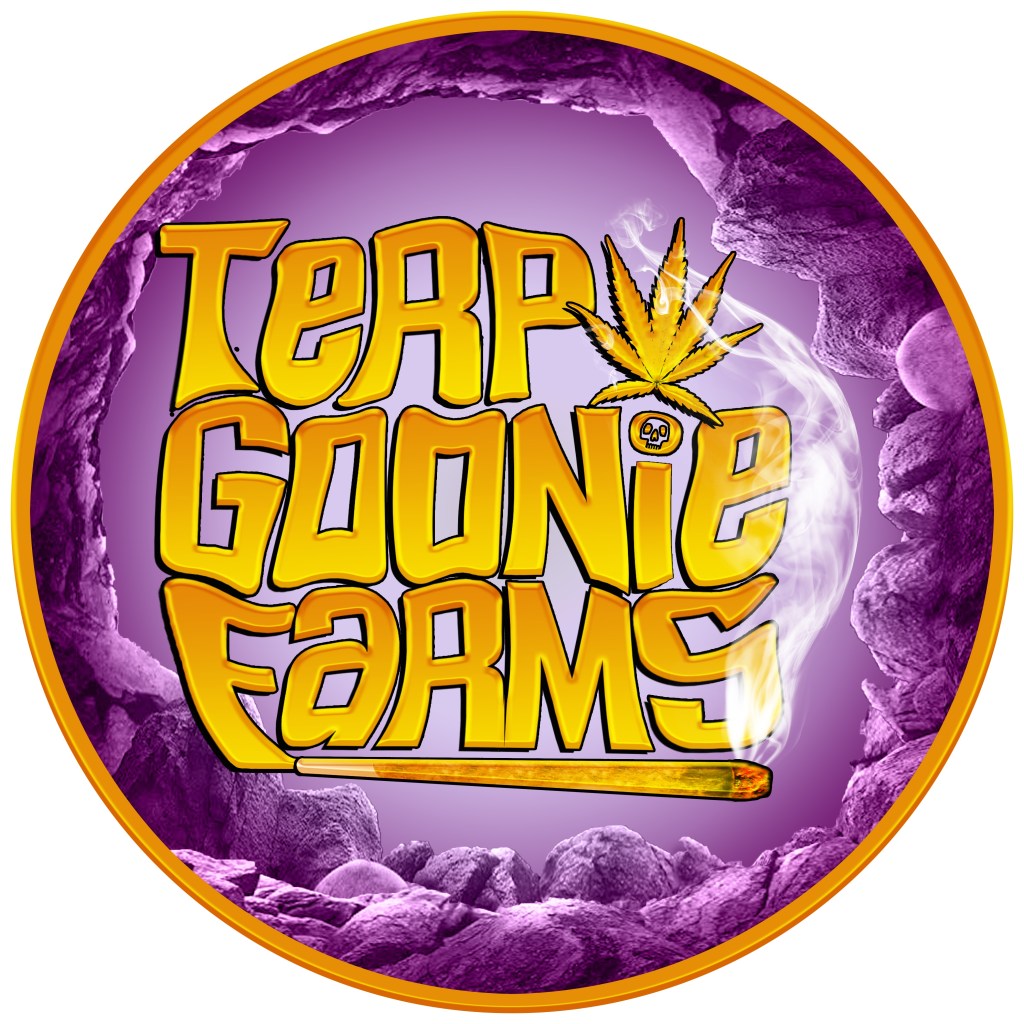
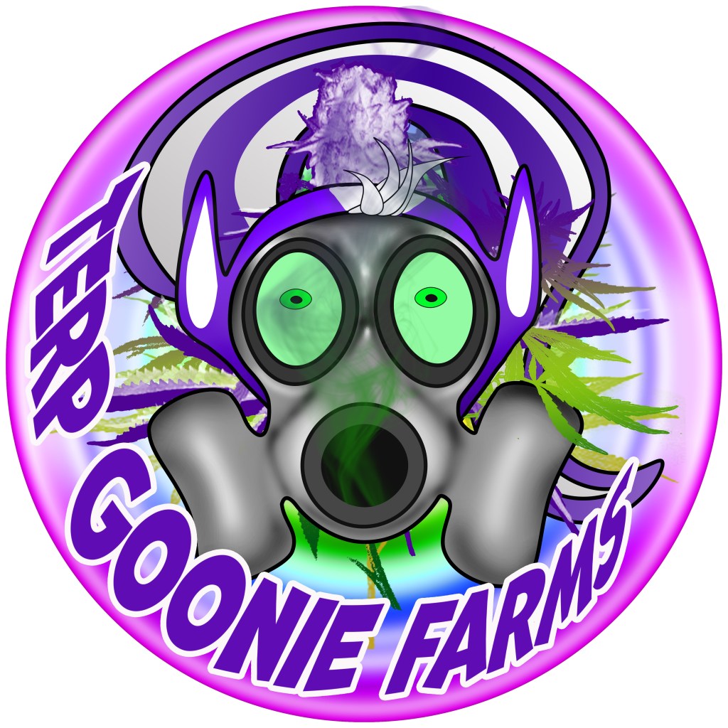
Terp Goonie Farms
The folks at Terp Goonie Farms wanted a icon inspired by the movie “The Goonies” So I tried to adhere to the color and look of the movie graphics and played with the backgrounds.
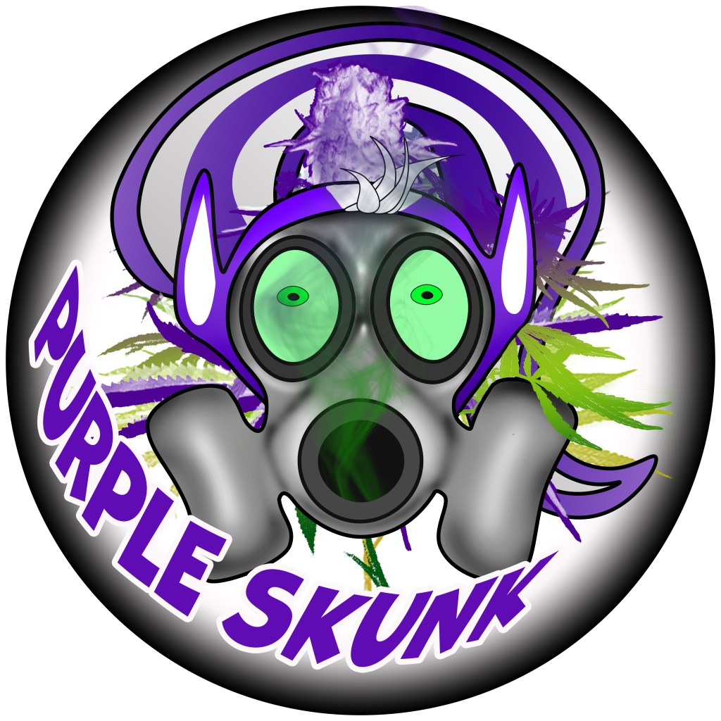
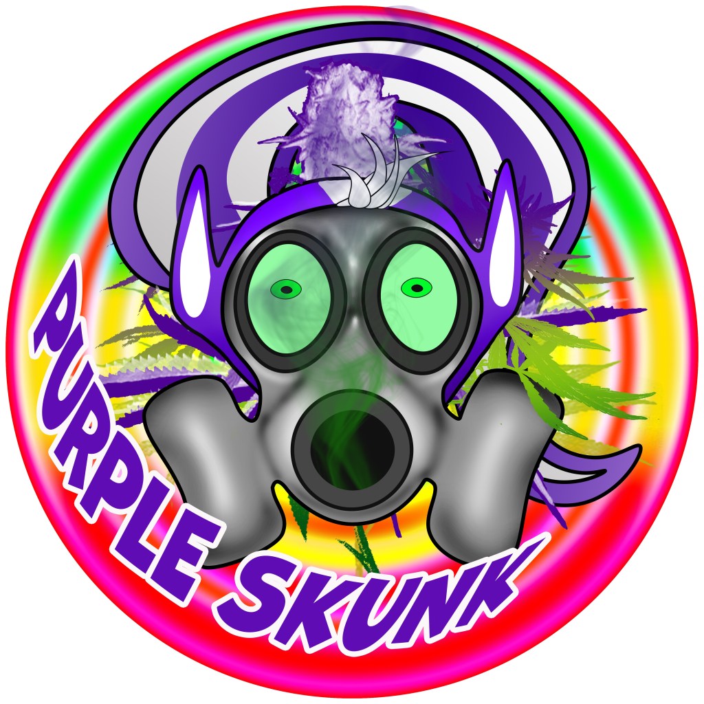
Purple Skunk & Terp Goonie Farms
Purple Skunk wanted a purple skunk obviously, hahaha but also wanted the skunk to be wearing a gas mask. After doing some quick research I could find a few good examples online but chose to design my own original skunk for this graphic.
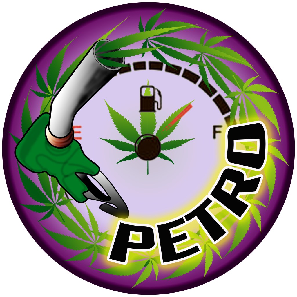
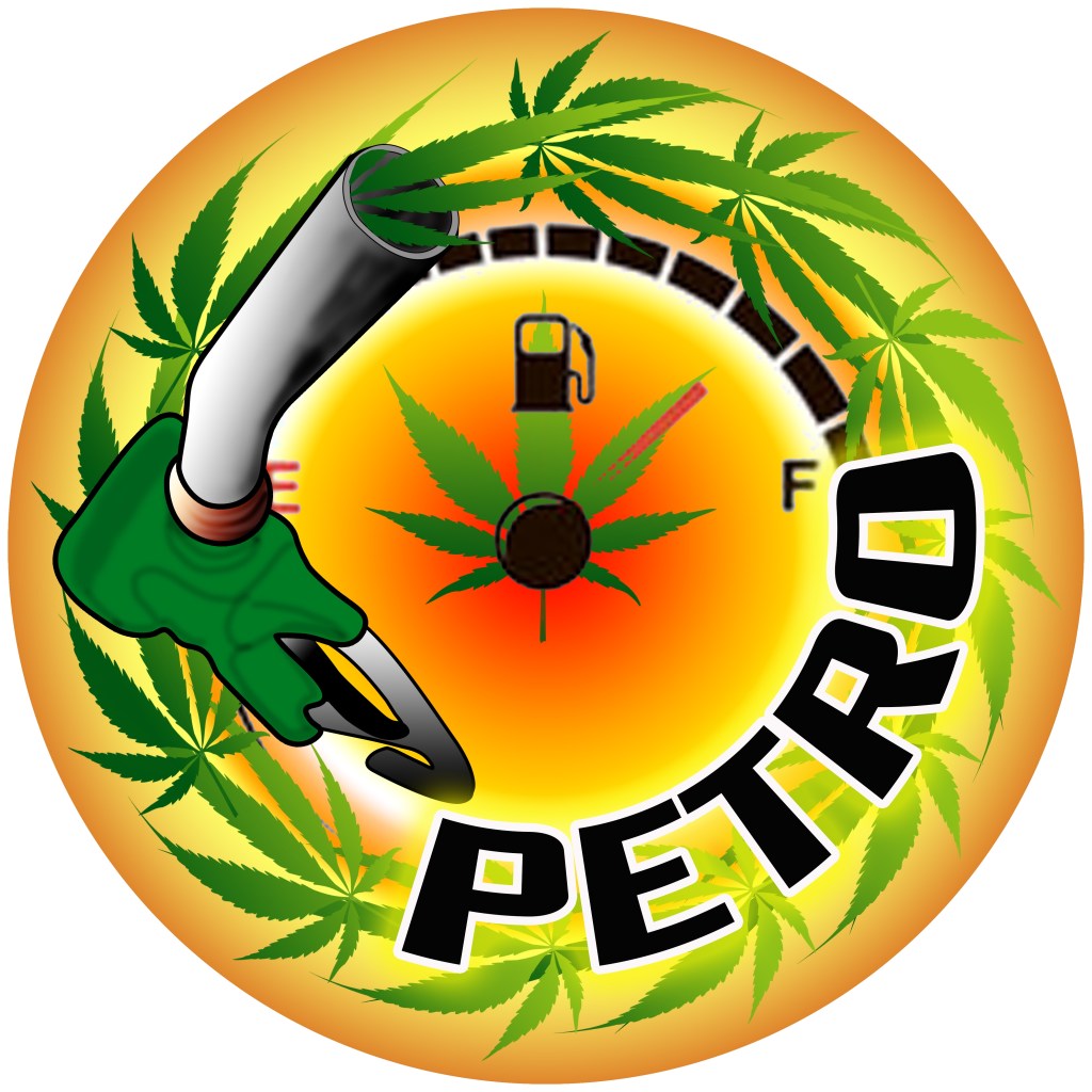
Petro
Petro wanted a logo based on petrol or gas products incorporated with cannabis. Once the base design was established I just played with the background

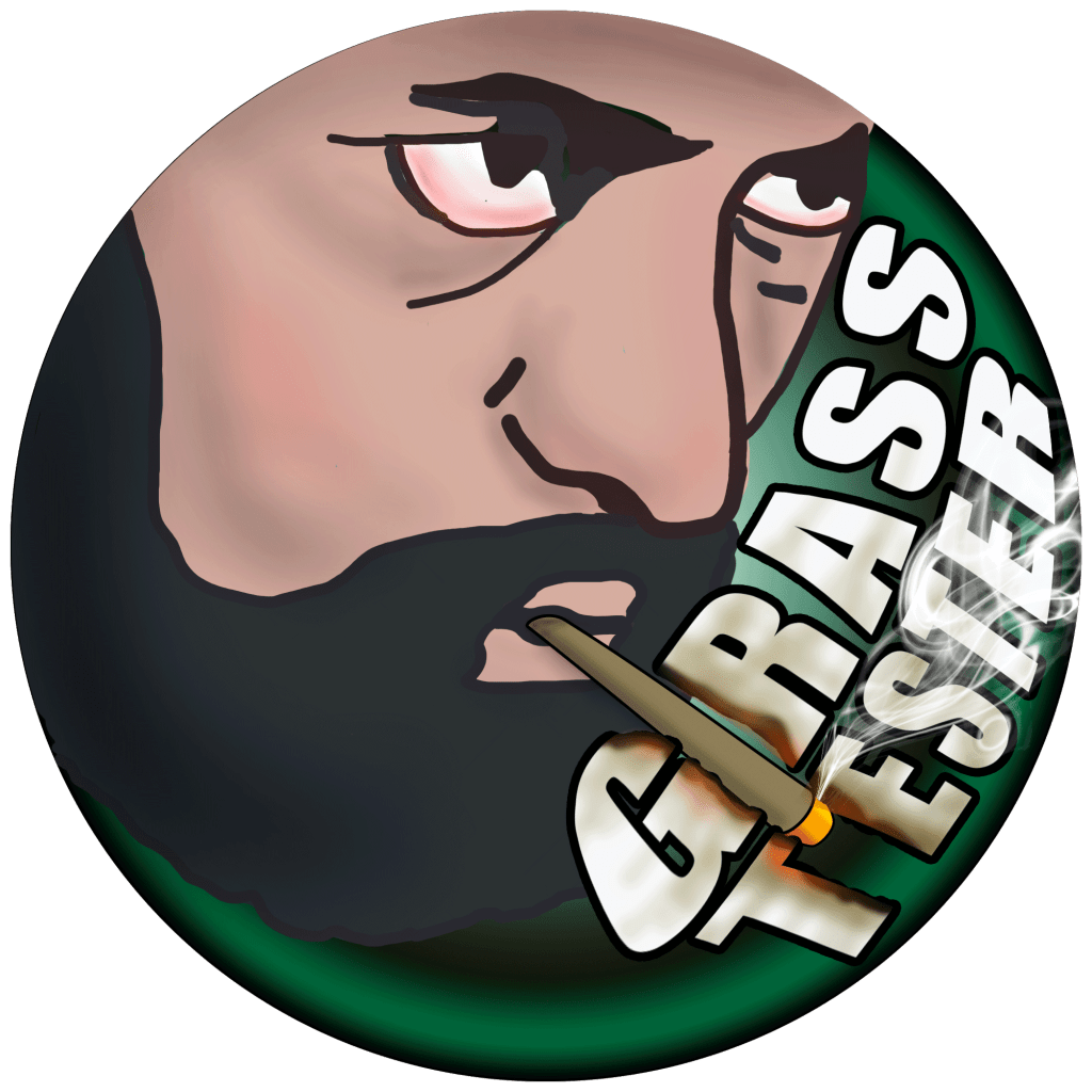
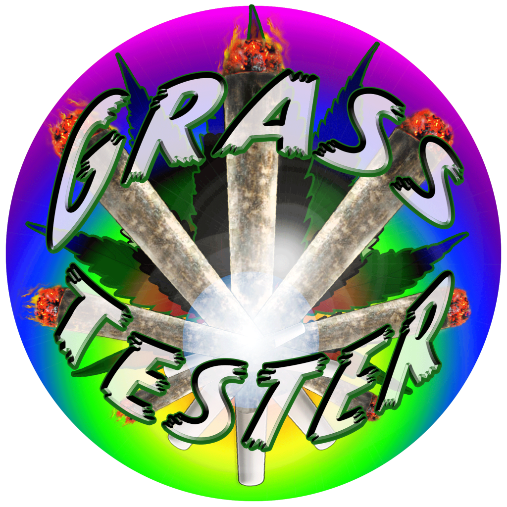
Grass Tester
Grass Testers logo was based on a picture I saw of the Hermit Card in a Tarot card deck and thought it looked just like him, So I thought it would be a good fit. The Other Two were just early ideas.

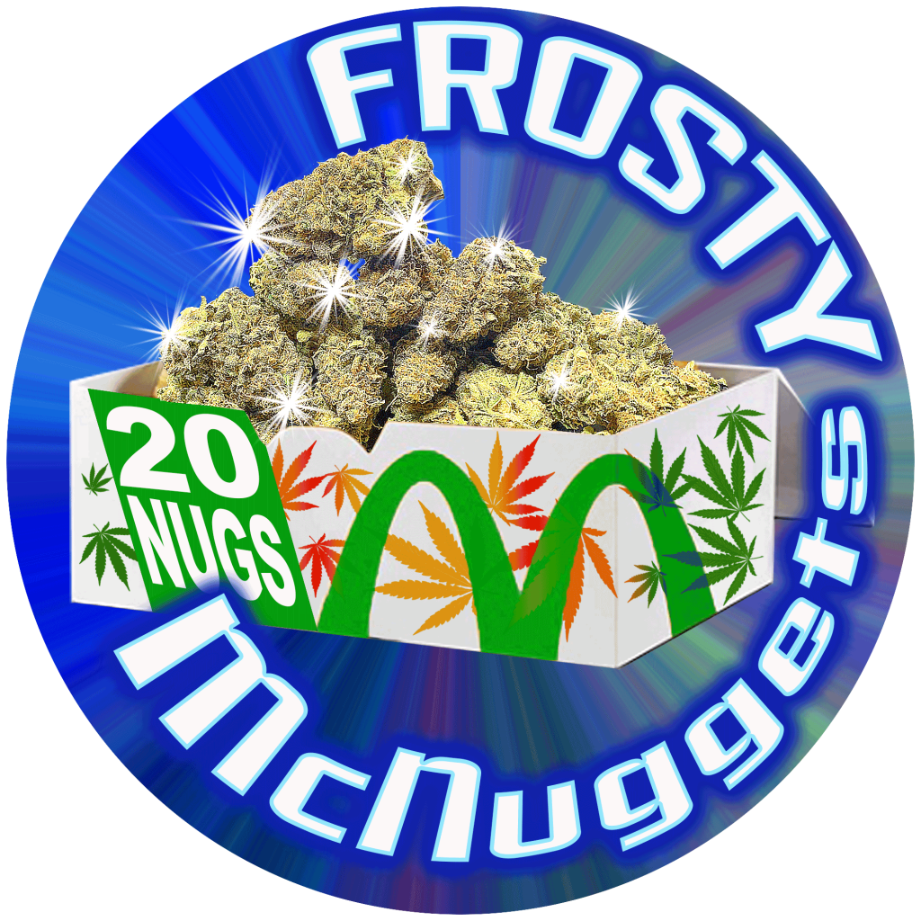
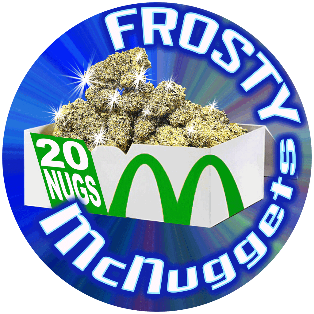
Frosty McNuggets
Frosty was pretty specific on what he wanted which makes it pretty easy to get it right on the first draft. He wanted a box of 20 nuggets as buds and showing frost of sorts.

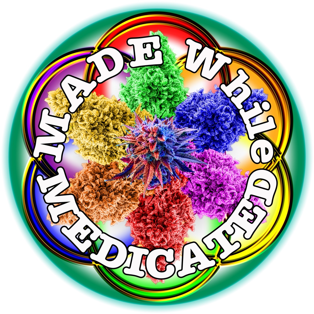
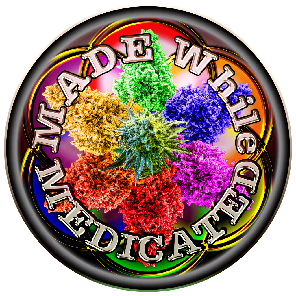
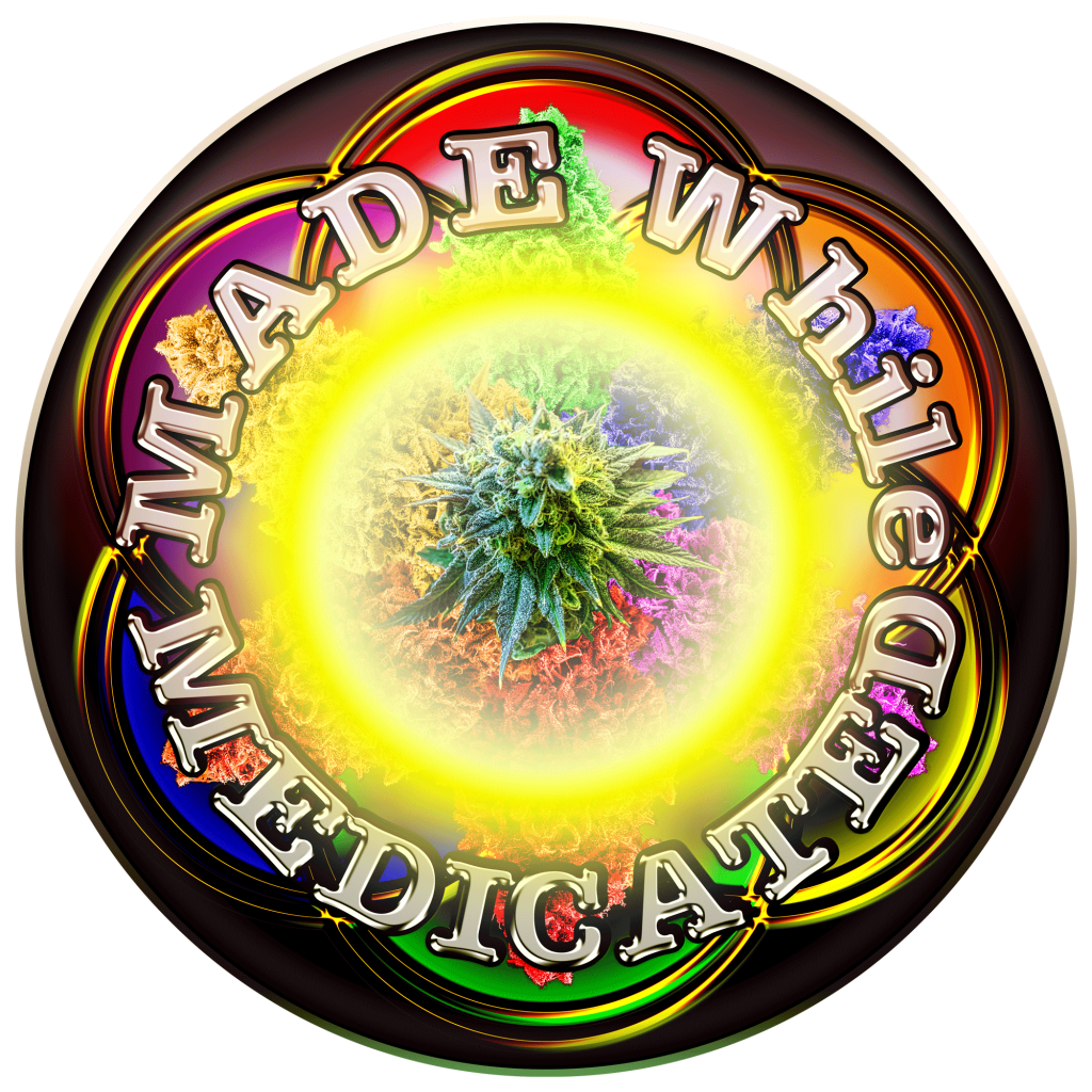
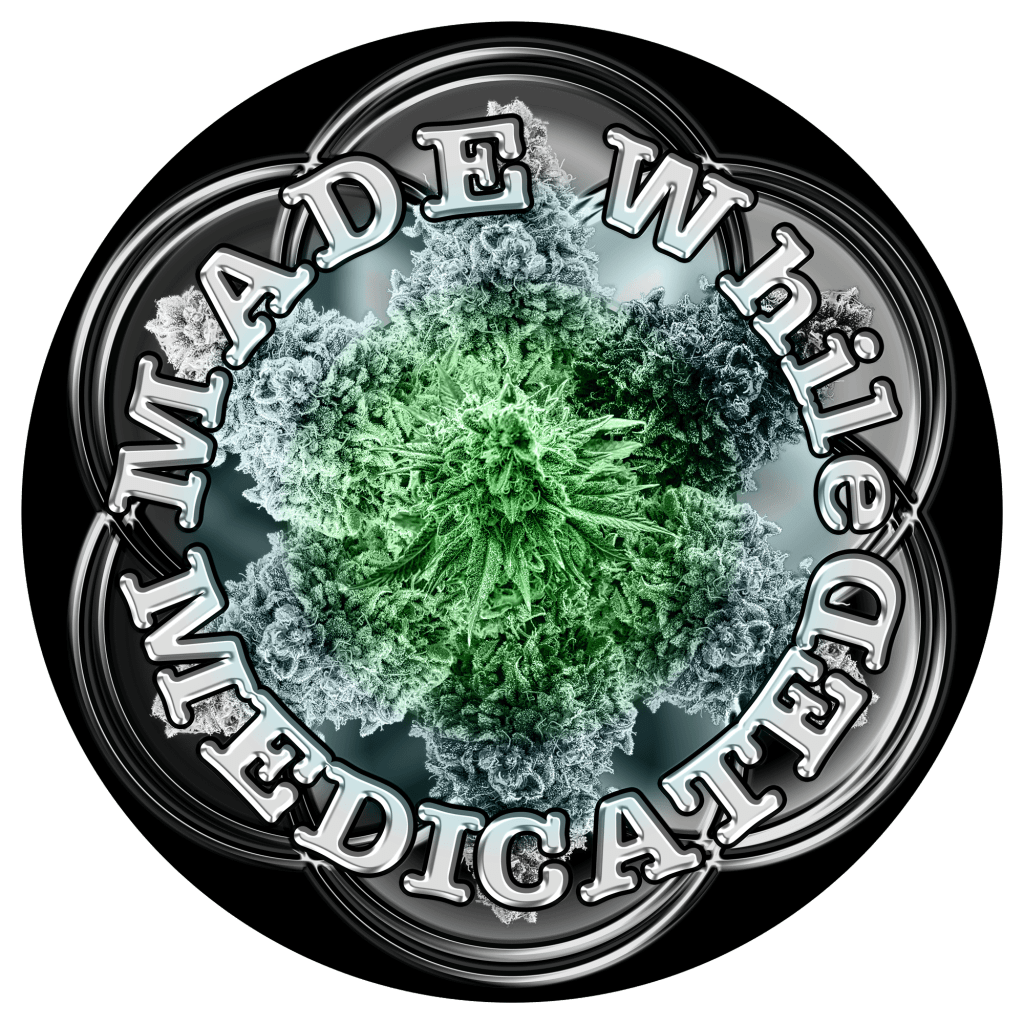
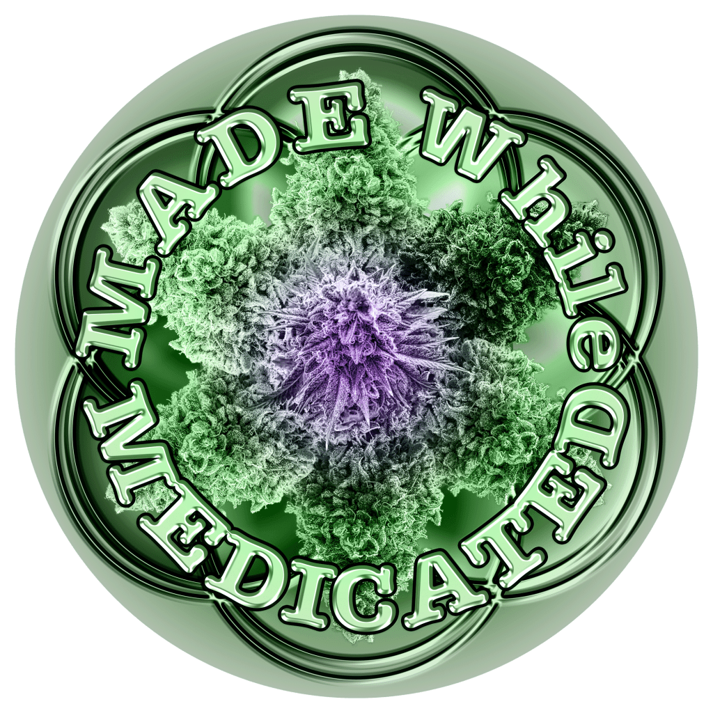
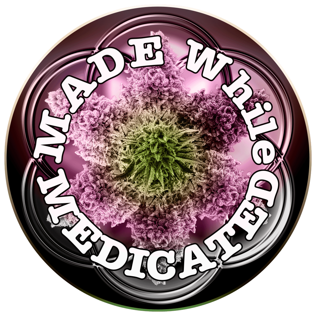
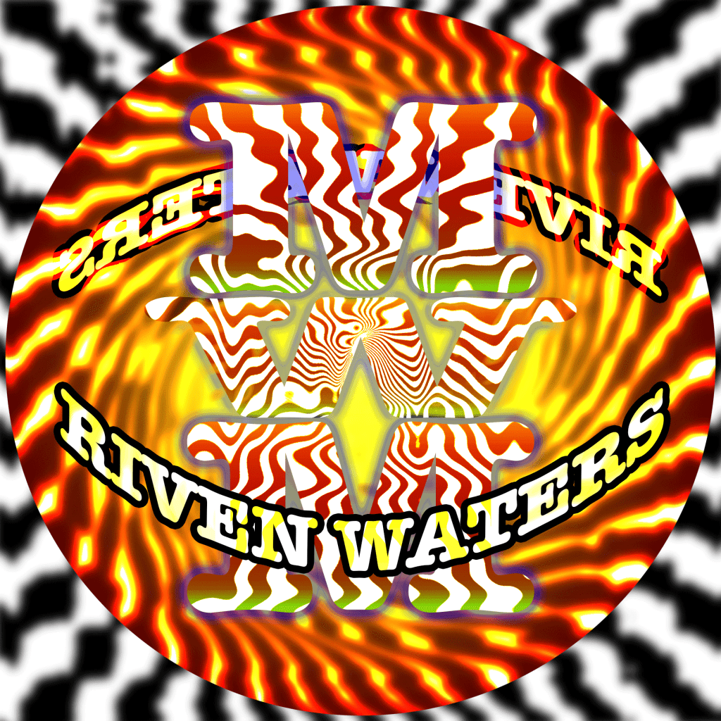
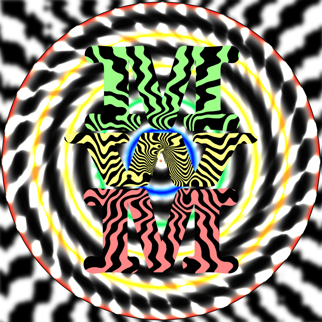
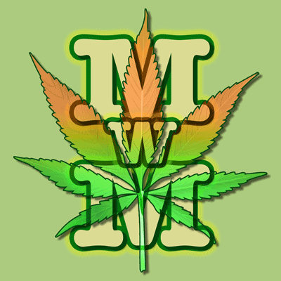
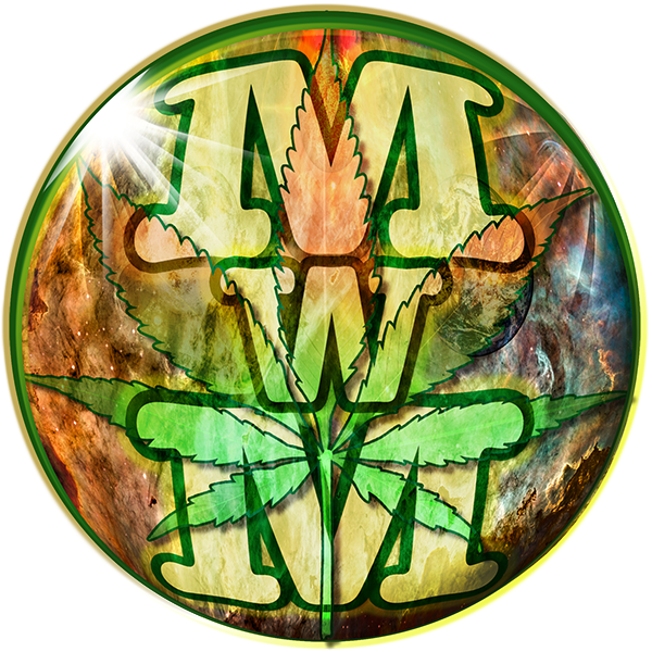
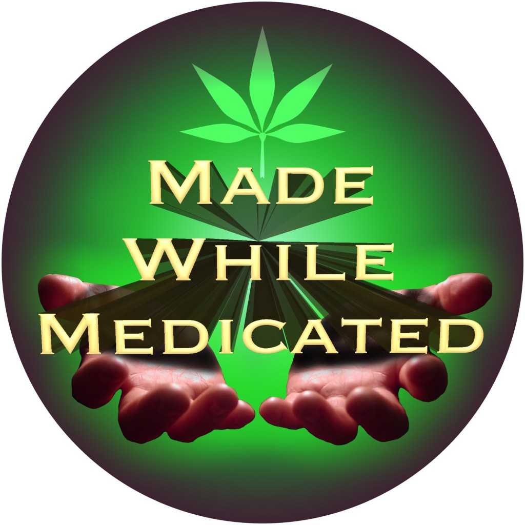
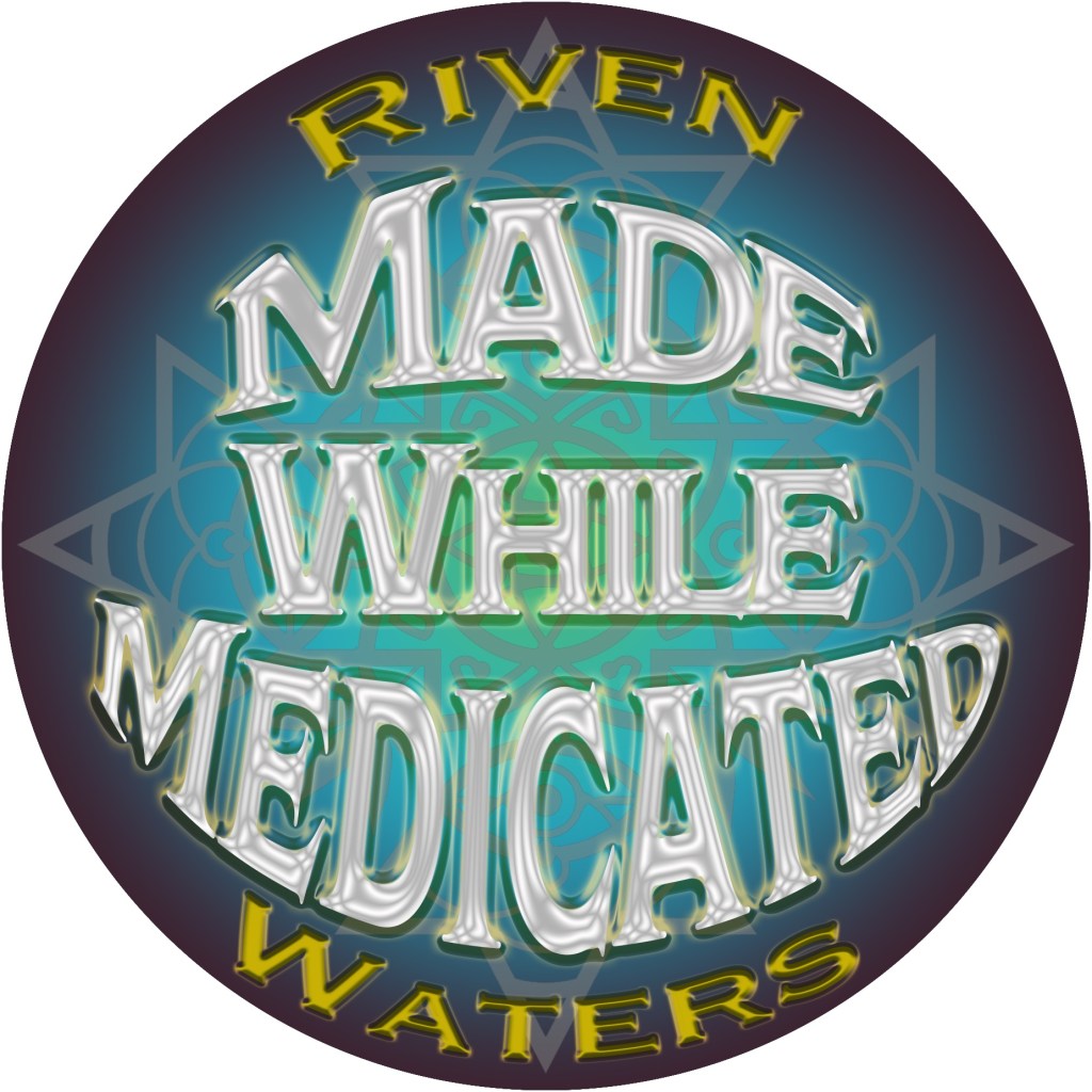
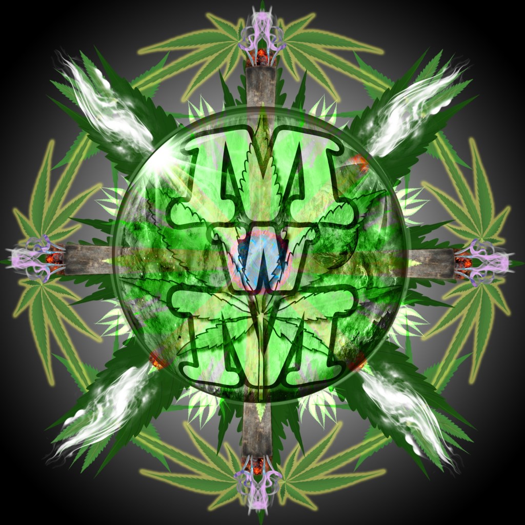
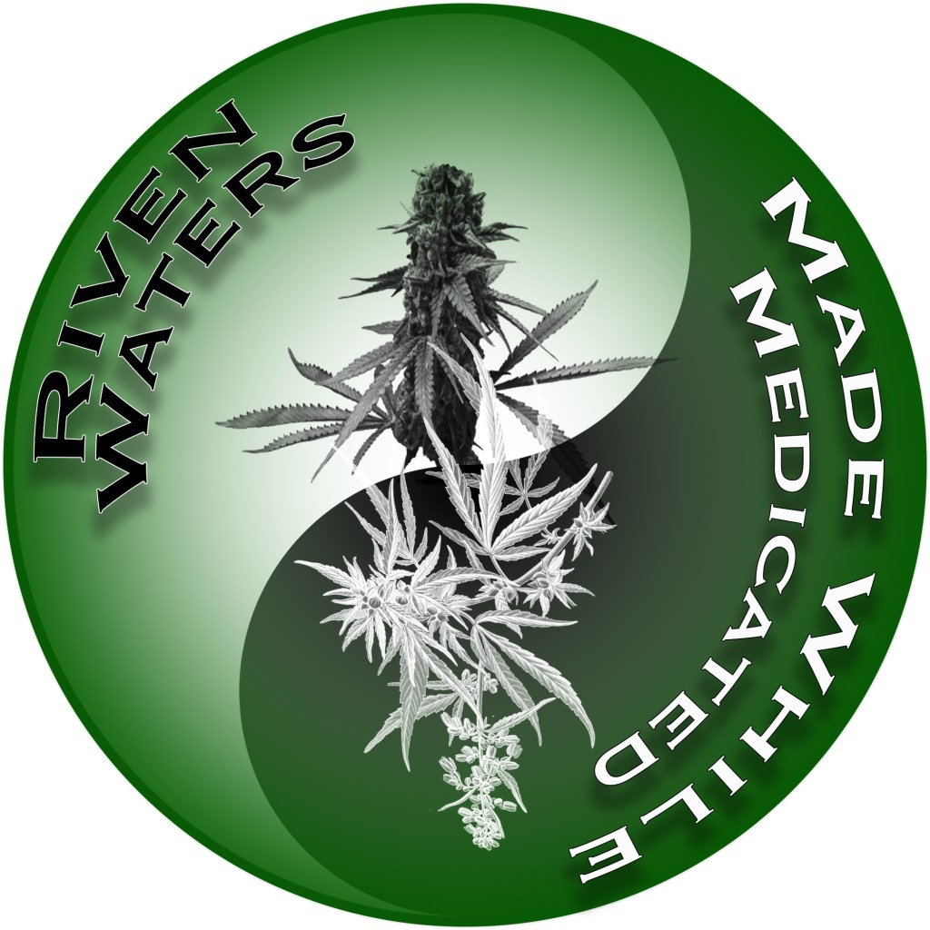
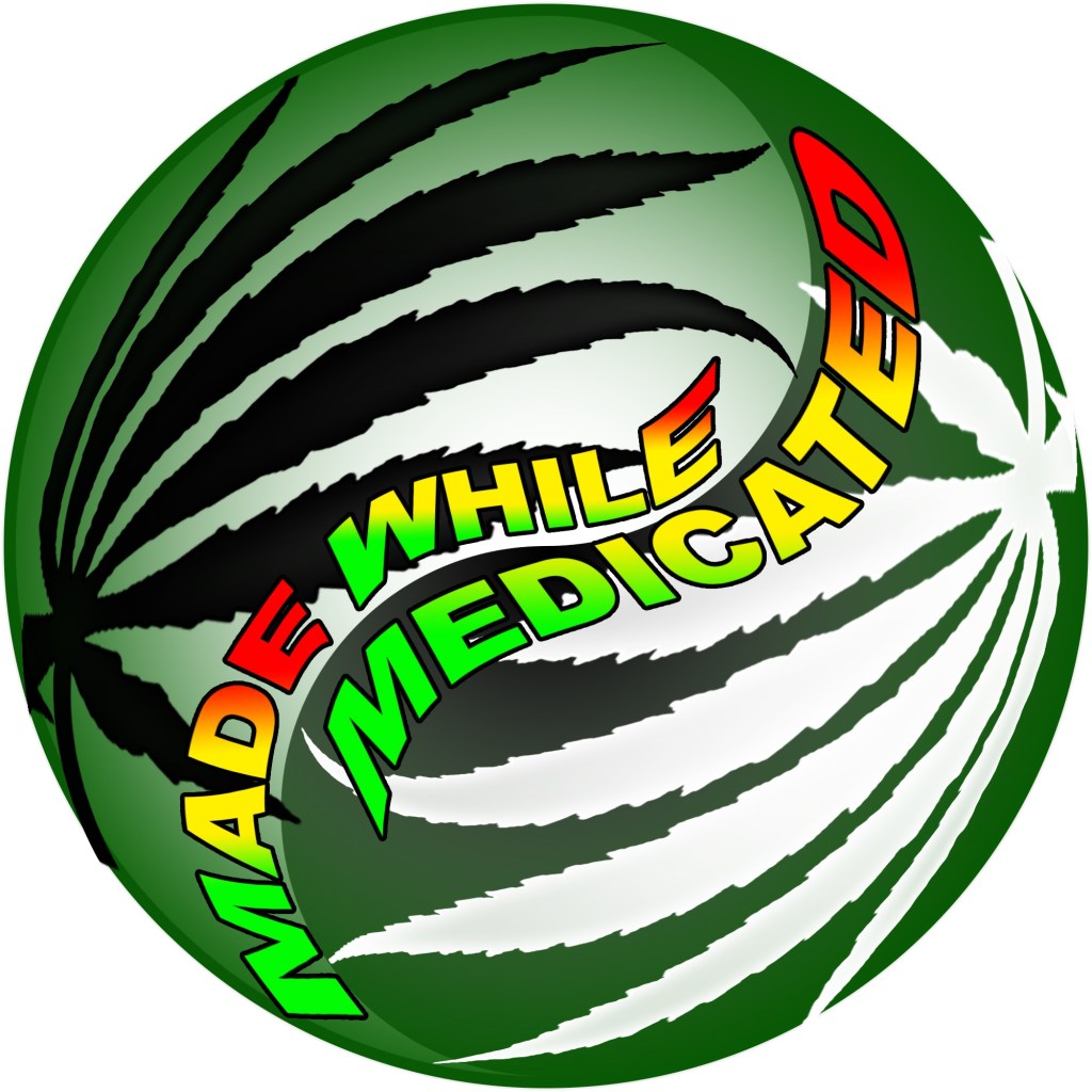
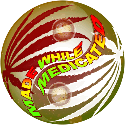
Made While Medicated / Riven Waters
For my Logo I wanted to used the Made While Medicated words or letters incorporated with cannabis as part of my logo. This will continue to be a work in progress.